library(tidyverse)
library(tidyquant)
library(frenchdata)
library(scales)
library(fixest)Analyzing Seasonality in DAX Returns
R
Debunking the Halloween indicator for German market returns using R
Seasonalcharts.de claims that stock indices exhibit persistent seasonality that may be exploited through an appropriate trading strategy. As part of a job application, I had to replicate the seasonal pattern for the DAX and then test whether this pattern entails a profitable trading strategy. To sum up, I indeed find that a trading strategy that holds the index only over a specific season outperforms the market significantly, but these results might be driven by a few outliers. Note that the post below references an opinion and is for information purposes only. I do not intend to provide any investment advice.
The code is structured in a way that allows for a straight-forward replication of the methodology for other indices. The post uses the following packages:
Data Preparation
First, download data from yahoo finance using the tidyquant package. Note that the DAX was officially launched in July 1988, so this is where our sample starts.
dax_raw <- tq_get(
  "^GDAXI", get = "stock.prices",
  from = "1988-07-01", to = "2023-10-30"
)
Then, select only date and the adjusted price (i.e., closing price after adjustments for all applicable splits and dividend distributions) as the relevant variables and compute summary statistics to check for missing or weird values. The results are virtually the same if we use unadjusted closing prices.
dax <- dax_raw |>
  select(date, price = adjusted)
We replace the missing values by the last available index value.
dax <- dax |>
  arrange(date) |>
  fill(price, .direction = "down")
As a immediate plausibility check, we plot the DAX over the whole sample period.
dax |>
  ggplot(aes(x = date, y = price)) +
  geom_line() +
  labs(x = NULL, y = "Adjusted Price",
       title = "Adjusted DAX index price between 1988 and 2023") +
  scale_y_continuous(labels = scales::comma)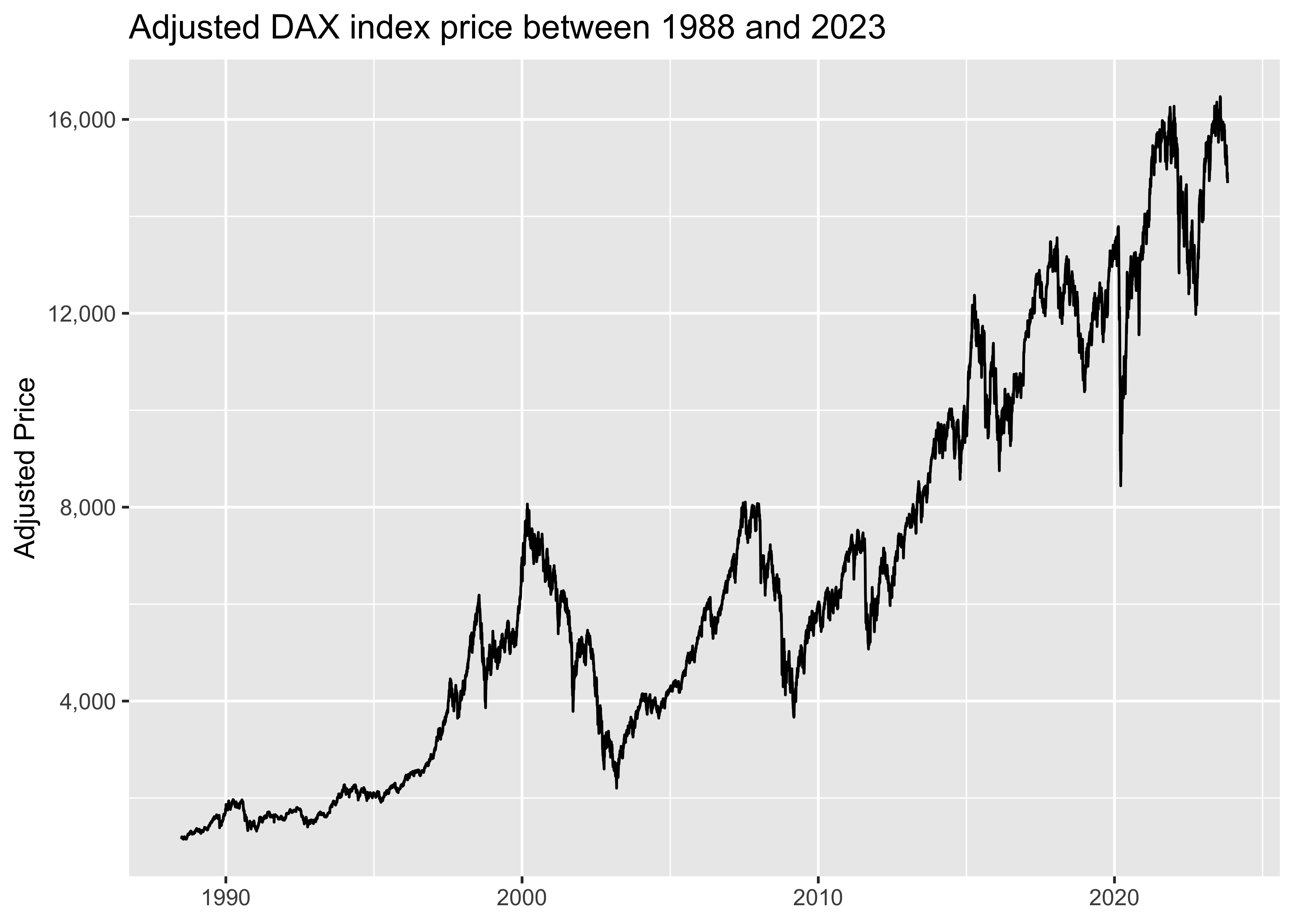
The main idea of Seasonalcharts is to implement the strategy proposed by Jacobsen and Bouman (2002)1 and Jacobsen and Zhan (2018)2 which they label ‘The Halloween Indicator’ (or ‘Sell in May Effect’). The main finding of these papers is that stock indices returns seem significantly lower during the May-October period than during the remainder of the year. The corresponding trading strategy holds an index during the months November-April, but holds the risk-free asset in the May-October period.
To replicate their approach (and avoid noise in the daily data), we focus on monthly returns from now on.
dax_monthly <- dax |>
  mutate(year = year(date),
         month = factor(month(date))) |>
  group_by(year, month) |>
  filter(date == max(date)) |>
  ungroup() |>
  arrange(date) |>
  mutate(ret = price / lag(price) - 1) |>
  drop_na()
And as usual in empirical asset pricing, we do not care about raw returns, but returns in excess of the risk-free asset. We simply add the European risk free rate from the Fama-French data library as the corresponding reference point. Of course, one could use other measures for the risk-free rate, but the impact on the results won’t be substantial.
factors_ff3_monthly_raw <- download_french_data("Fama/French 3 Factors")

risk_free_monthly <- factors_ff3_monthly_raw$subsets$data[[1]] |>
  mutate(
    year = year(ymd(str_c(date, "01"))),
    month = factor(month(ymd(str_c(date, "01")))),
    rf = as.numeric(RF) / 100,
    .keep = "none"
  )

dax_monthly <- dax_monthly |>
  left_join(risk_free_monthly, join_by(year, month)) |>
  mutate(ret_excess = ret - rf) |>
  drop_na()
Graphical Evidence for Seasonality
We start by first plotting the average returns for each month.
dax_monthly |>
  group_by(month) |>
  summarize(ret = mean(ret)) |>
  ggplot(aes(x = month, y = ret, fill = ret > 0)) +
  geom_col() +
  scale_y_continuous(labels = percent) +
  labs(
    x = "Month", y = "Average DAX Return",
    title = "Average monthly DAX returns between 1988 and 2023"
  ) +
  theme(legend.position = "none")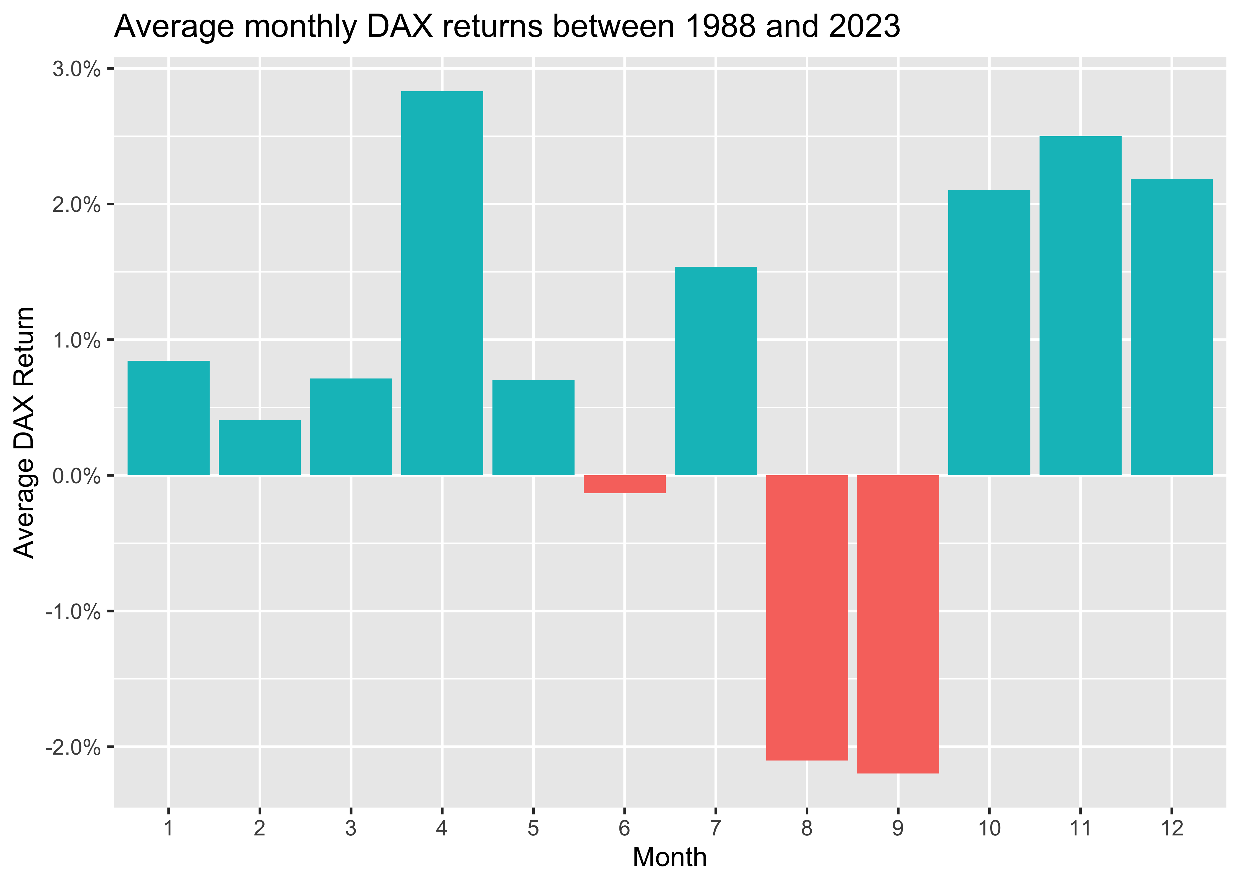
The figure shows negative returns for June, August, and September, while all other months exhibit positive returns. However, it makes more sense to look at distributions instead of simple means, which might be heavily influenced by outliers. To illustrate distributions, I follow Cedric Scherer and use raincloud plots. which combine halved violin plot, a box plot, and the raw data as some kind of scatter. These plots hence provide detailed visualizations of the distributions.
dax_monthly |>
  ggplot(aes(x = month, y = ret, group = month)) +
  ggdist::stat_halfeye(
    adjust = .5, width = .6, .width = 0, justification = -.3, point_colour = NA
    ) +
  geom_boxplot(
    width = .25, outlier.shape = NA
    ) +
  stat_summary(
    fun = mean, geom="point", color = "red", fill = "red"
    ) +
  geom_point(
    size = 1.5, alpha = .2, position = position_jitter(seed = 42, width = .1)
    ) +
  geom_hline(aes(yintercept = 0), linetype = "dashed") +
  labs(
    x = "Month", y = "DAX Return",
    title = "Distributions of monthly DAX returns between 1988 and 2023",
    subtitle = "Red dots indicate means, solid lines indicate medians"
) 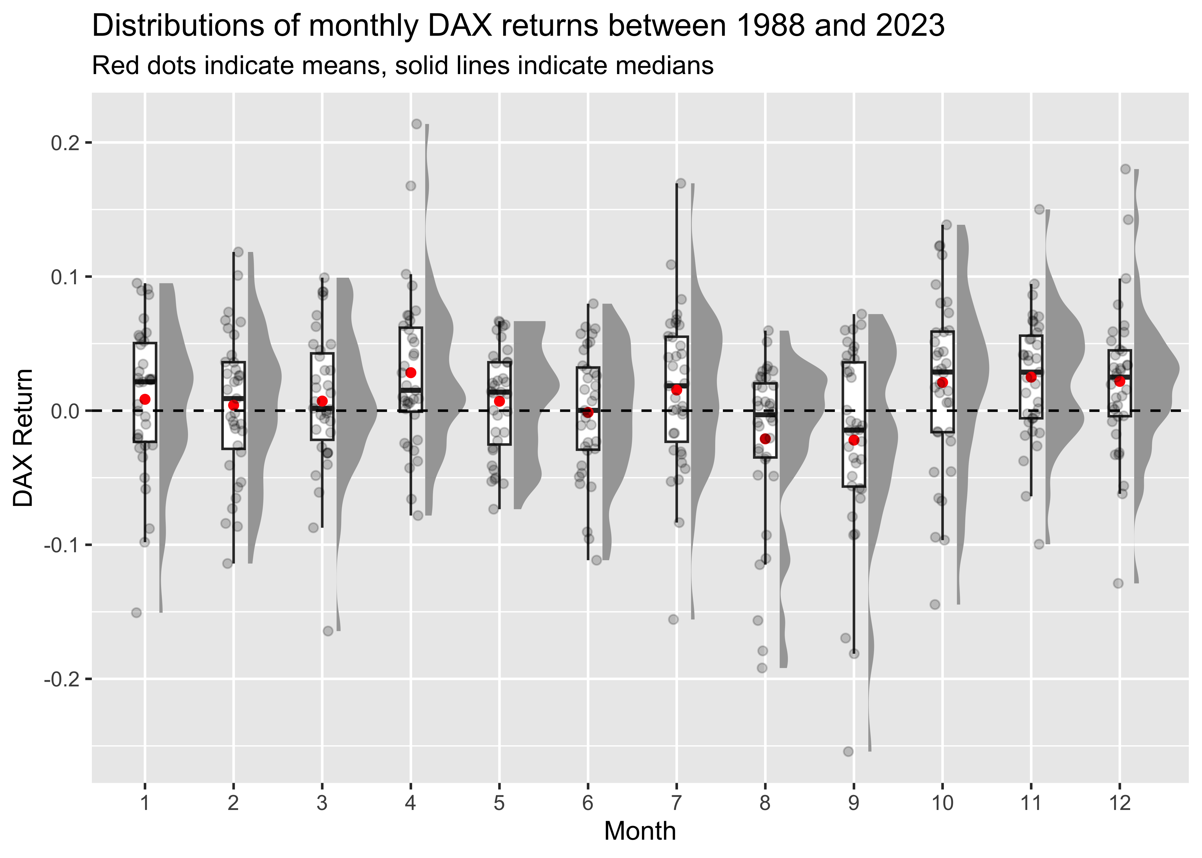
The figure suggests that August and September exhibit considerable negative outliers.
Evaluating Trading Strategies
Let us now take a look at the average excess returns per month. We also add the standard deviation, 5% and 95% quantiles, and t-statistic of a t-test of the null hypothesis that average returns are zero in a given month.
dax_monthly |>
  drop_na(ret_excess) |>
  group_by(Month = month) |>
  summarize(
    Mean = mean(ret_excess),
    SD = sd(ret_excess),
    Q05 = quantile(ret_excess, 0.05),
    Q95 = quantile(ret_excess, 0.95),
    `t-Statistic` = sqrt(n()) * mean(ret_excess) / sd(ret_excess)
  )
# A tibble: 12 × 6
Month Mean SD Q05 Q95 `t-Statistic`
<fct> <dbl> <dbl> <dbl> <dbl> <dbl>
1 1 0.00621 0.0552 -0.0911 0.0868 0.666
2 2 0.00200 0.0541 -0.0868 0.0775 0.219
3 3 0.00486 0.0539 -0.0732 0.0842 0.533
4 4 0.0260 0.0599 -0.0502 0.119 2.57
5 5 0.00470 0.0401 -0.0573 0.0610 0.693
6 6 -0.00353 0.0476 -0.0934 0.0587 -0.439
7 7 0.0131 0.0598 -0.0658 0.0902 1.29
8 8 -0.0235 0.0622 -0.168 0.0347 -2.27
9 9 -0.0244 0.0730 -0.176 0.0613 -2.01
10 10 0.0186 0.0660 -0.0960 0.122 1.70
11 11 0.0228 0.0483 -0.0455 0.0862 2.79
12 12 0.0195 0.0554 -0.0586 0.108 2.08 August and September seem to usually exhibit negative excess returns with an average of about -2.4% (statistically significant) over all years, while April is the only months that tend to exhibit statistically significant positive excess returns.
Let us proceed to test for the presence of statistically significant excess returns due to seasonal patterns. In the above table, I only test for significance for each month separately. To test for positive returns in a joint model, I regress the monthly excess returns on month indicators. Note that I always adjust the standard errors to be heteroskedasticity robust.
model_monthly <- feols(
  ret_excess ~ month,
  data = dax_monthly,
  vcov = "hetero"
)

summary(model_monthly)
OLS estimation, Dep. Var.: ret_excess
Observations: 423
Standard-errors: Heteroskedasticity-robust
Estimate Std. Error t value Pr(>|t|)
(Intercept) 0.006214 0.009331 0.665936 0.505825
month2 -0.004210 0.013064 -0.322298 0.747391
month3 -0.001355 0.013045 -0.103901 0.917298
month4 0.019820 0.013762 1.440170 0.150581
month5 -0.001516 0.011533 -0.131456 0.895479
month6 -0.009744 0.012318 -0.791049 0.429372
month7 0.006857 0.013752 0.498605 0.618325
month8 -0.029730 0.013951 -2.131118 0.033672 *
month9 -0.030625 0.015334 -1.997223 0.046460 *
month10 0.012424 0.014422 0.861410 0.389514
month11 0.016551 0.012399 1.334888 0.182652
month12 0.013261 0.013224 1.002802 0.316547
---
Signif. codes: 0 '***' 0.001 '**' 0.01 '*' 0.05 '.' 0.1 ' ' 1
RMSE: 0.056177 Adj. R2: 0.048833Seems like August and September have on average indeed lower returns than January (which is the omitted reference point in this regression). Note that the size of the coefficients from the regression are the same as in the table above (i.e., constant plus coefficient), but the t-statistics are different because we are estimating a joint model now.
As the raincloud plots indicated that outliers might drive any statistical significant differences, we estimate the model again after trimming the data. In particular, we drop the top and bottom 1% of observations. This trimming step only drops 10 observations.
ret_excess_q01 <- quantile(dax_monthly$ret_excess, 0.01)
ret_excess_q99 <- quantile(dax_monthly$ret_excess, 0.99)

model_monthly_trimmed <- feols(
  ret_excess ~ month,
  data = dax_monthly |>
     filter(ret_excess >= ret_excess_q01 & ret_excess <= ret_excess_q99),
  vcov = "hetero"
)

etable(model_monthly, model_monthly_trimmed, coefstat = "tstat")
model_monthly model_monthly_t..
Dependent Var.: ret_excess ret_excess
Constant 0.0062 (0.6659) 0.0062 (0.6657)
month2 -0.0042 (-0.3223) -0.0042 (-0.3222)
month3 -0.0014 (-0.1039) -0.0014 (-0.1039)
month4 0.0198 (1.440) 0.0099 (0.8135)
month5 -0.0015 (-0.1315) -0.0015 (-0.1314)
month6 -0.0097 (-0.7910) -0.0097 (-0.7908)
month7 0.0069 (0.4986) 0.0024 (0.1805)
month8 -0.0297* (-2.131) -0.0201 (-1.602)
month9 -0.0306* (-1.997) -0.0142 (-1.127)
month10 0.0124 (0.8614) 0.0124 (0.8611)
month11 0.0165 (1.335) 0.0128 (1.071)
month12 0.0133 (1.003) 0.0087 (0.6897)
_______________ _________________ _________________
VCOV type Heteroskeda.-rob. Heteroskeda.-rob.
Observations 423 413
R2 0.07363 0.03824
Adj. R2 0.04883 0.01186
---
Signif. codes: 0 '***' 0.001 '**' 0.01 '*' 0.05 '.' 0.1 ' ' 1Indeed, now no month exhibits a statistically significant outperformance compared to January.
Next, I follow Jacobsen and Bouman (2002) and simply regress excess returns on dummies that indicate specific seasons, i.e., I estimate the model
\[ y_t=\alpha + \beta D_t + \epsilon_t,\]
where \(D_t\) is a dummy variable equal to one for the months in a specific season and zero otherwise. We consider both the ‘Halloween’ season (where the dummy is one for November-April). If \(D_t\) is statistically significant and positive for the corresponding season, then we take this as evidence for the presence of seasonality effects.
halloween_months <- c(11, 12, 1, 2, 3, 4)

dax_monthly <- dax_monthly |>
  mutate(halloween = if_else(month %in% halloween_months, 1L, 0L))
We again estimate two models to analyze the ‘Halloween’ effect:
model_halloween <- feols(
  ret_excess ~ halloween,
  data = dax_monthly,
  vcov = "hetero"
)

model_halloween_trimmed <- feols(
  ret_excess ~ halloween,
  data = dax_monthly |>
     filter(ret_excess >= ret_excess_q01 & ret_excess <= ret_excess_q99),
  vcov = "hetero"
)

etable(model_halloween, model_halloween_trimmed, coefstat = "tstat")
model_halloween model_hallowe..
Dependent Var.: ret_excess ret_excess
Constant -0.0026 (-0.6254) 0.0013 (0.3592)
halloween 0.0162** (2.872) 0.0091. (1.806)
_______________ _________________ _______________
VCOV type Heteroskeda.-rob. Heteroske.-rob.
Observations 423 413
R2 0.01919 0.00787
Adj. R2 0.01685 0.00546
---
Signif. codes: 0 '***' 0.001 '**' 0.01 '*' 0.05 '.' 0.1 ' ' 1We indeed find evidence that excess returns are higher during the months November-April relative to the remaining months in the full sample. However, if we remove the top and bottom 1% of observations, then the statistical significant outperformance disappears again.
As a last step, let us compare three different strategies: (i) buy and hold the index over the full year, (ii) go long in the index outside of the Halloween season and otherwise hold the risk-free asset, and (iii) go long in the index outside of the Halloween season and otherwise short the index. Below I compare the returns of the three different strategies on an annual basis:
dax_monthly <- dax_monthly |>
  mutate(
    ret_excess_halloween = if_else(halloween == 1, ret_excess, 0),
    ret_excess_halloween_short = if_else(halloween == 1, ret_excess, -ret_excess)
  )
Which of these strategies might constitute a better investment opportunity? For a very simple assessment, let us compute the corresponding Sharpe ratios. Note that I annualize Sharpe ratios by multiplying them with \(\sqrt{12}\) which strictly speaking only works under IID distributed returns (which is typically unlikely to be the case), but which suffices for the purpose of this post.
sharpe_ratio <- function(x) {
  sqrt(12) *  mean(x) / sd(x)
}

bind_rows(
  dax_monthly |>
    summarize(
      `Buy and Hold` = sharpe_ratio(ret),
      `Halloween` = sharpe_ratio(ret_excess_halloween),
      `Halloween-Short` = sharpe_ratio(ret_excess_halloween_short)
    ) |>
    mutate(Data = "Full"),
  dax_monthly |>
    filter(ret_excess >= ret_excess_q01 & ret_excess <= ret_excess_q99) |>
    summarize(
      `Buy and Hold` = sharpe_ratio(ret_excess),
      `Halloween` = sharpe_ratio(ret_excess_halloween),
      `Halloween-Short` = sharpe_ratio(ret_excess_halloween_short)
    ) |>
    mutate(Data = "Trimmed")
) |>
  select(Data, everything())
# A tibble: 2 × 4
Data `Buy and Hold` Halloween `Halloween-Short`
<chr> <dbl> <dbl> <dbl>
1 Full 0.458 0.596 0.479
2 Trimmed 0.394 0.502 0.305The Sharpe ratio suggests that the Halloween strategy is a better investment opportunity than the other strategies for both the full and the trimmed sample. Shorting the market in the Halloween season even leads to worse performance than just staying invested in the market the whole time once we drop the outliers.
To sum up, this post showed some simple data-related issues that we should consider when we analyze return data. Overall, we could find strong support for this seasonality effect from a statistical perspective once we get rid of a few extreme observations.
Footnotes
Bouman, Sven and Jacobsen, Ben (2002). “The Halloween Indicator, ‘Sell in May and Go Away’: Another Puzzle”, The American Economic Review, Vol. 92, No. 5, pp. 1618-1635, https://www.jstor.org/stable/3083268↩︎
Jacobsen, Ben and Zhang, Cherry Yi (2018), “The Halloween Indicator, ‘Sell in May and Go Away’: Everywhere and All the Time”, https://ssrn.com/abstract=2154873↩︎