library(ggplot2)
library(palmerpenguins)

penguins <- na.omit(palmerpenguins::penguins)Tidy Data Visualization: ggplot2 vs plotnine
R
Python
Visualization
A comparison of implementations of the grammar of graphics in R and Python.
Both ggplot2 and plotnine are based on Leland Wilkinson’s Grammar of Graphics, a set of principles for creating consistent and effective statistical graphics. This means they both use similar syntax and logic for constructing plots, making it relatively easy for users to transition between them. ggplot2, developed by Hadley Wickham, is a cornerstone of the R community and integrates seamlessly with other tidyverse packages. plotnine, on the other hand, is a Python package that attempts to bring ggplot2 functionality and philosophy to Python users, but it is not part of a larger ecosystem (although it works well with pandas, Python’s most popular data manipulation package).
Both packages use a layer-based approach, where a plot is built up by adding components like axes, geoms, stats, and scales. However, ggplot2 benefits from R’s native support for data frames and its formula notation, which can make its syntax more concise. plotnine has to adhere to Python’s syntax rules, in particular referring to columns via strings, which can occasionally lead to more verbose code. As you can see in the examples below, the syntactic differences are miniscule.
The types of plots that I chose for the comparison heavily draw on the examples given in R for Data Science - an amazing resource if you want to get started with data visualization.
Loading packages and data
We start by loading the main packages of interest and the popular palmerpenguins package that exists for both R and Python. We then use the penguins data frame as the data to compare all functions and methods below. Note that I drop all rows with missing values because I don’t want to get into related messages in this post.
from plotnine import *
from palmerpenguins import load_penguins

penguins = load_penguins().dropna()
A full-blown example
Let’s start with an advancved example that combines many different aesthetics at the same time: we plot two columns against each other, use color and shape aesthetics do differentiate species, include separate regression lines for each species, manually set nice labels, and use a theme. Except for the quotation of column names, plotnine has exactly the same syntax as ggplot2 - this is remarkable!
ggplot(penguins,
       aes(x = bill_length_mm, y = bill_depth_mm,
           color = species, shape = species)) +
  geom_point() +
  geom_smooth(method = "lm", formula = "y ~ x") +
  labs(x = "Bill length (mm)", y = "Bill Width (mm)",
       title = "Bill length vs. bill width",
       subtitle = "Using geom_point and geom_smooth of the ggplot2 package",
       color = "Species", shape = "Species") +
  theme_minimal()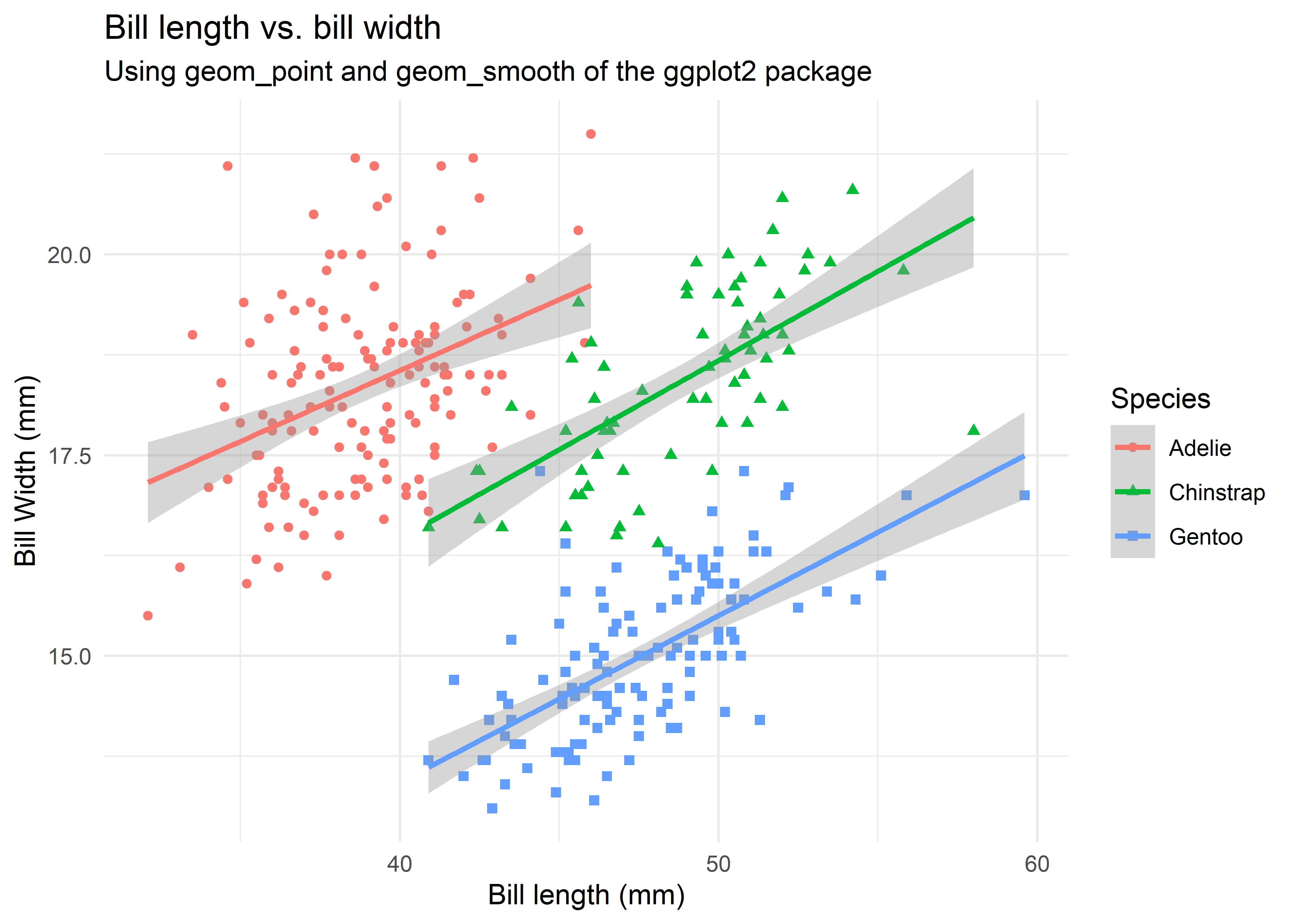
(ggplot(penguins,
        aes(x = "bill_length_mm", y = "bill_depth_mm",
            color = "species", shape = "species"))
  + geom_point()
  + geom_smooth(method = "lm", formula = "y ~ x")
  + labs(x = "Bill length (mm)", y = "Bill width (mm)",
         title = "Bill length vs. bill width",
         subtitle = "Using geom_point and geom_smooth of the plotnine package",
         color = "Species", shape = "Species")
  + theme_minimal()
)
<Figure Size: (640 x 480)>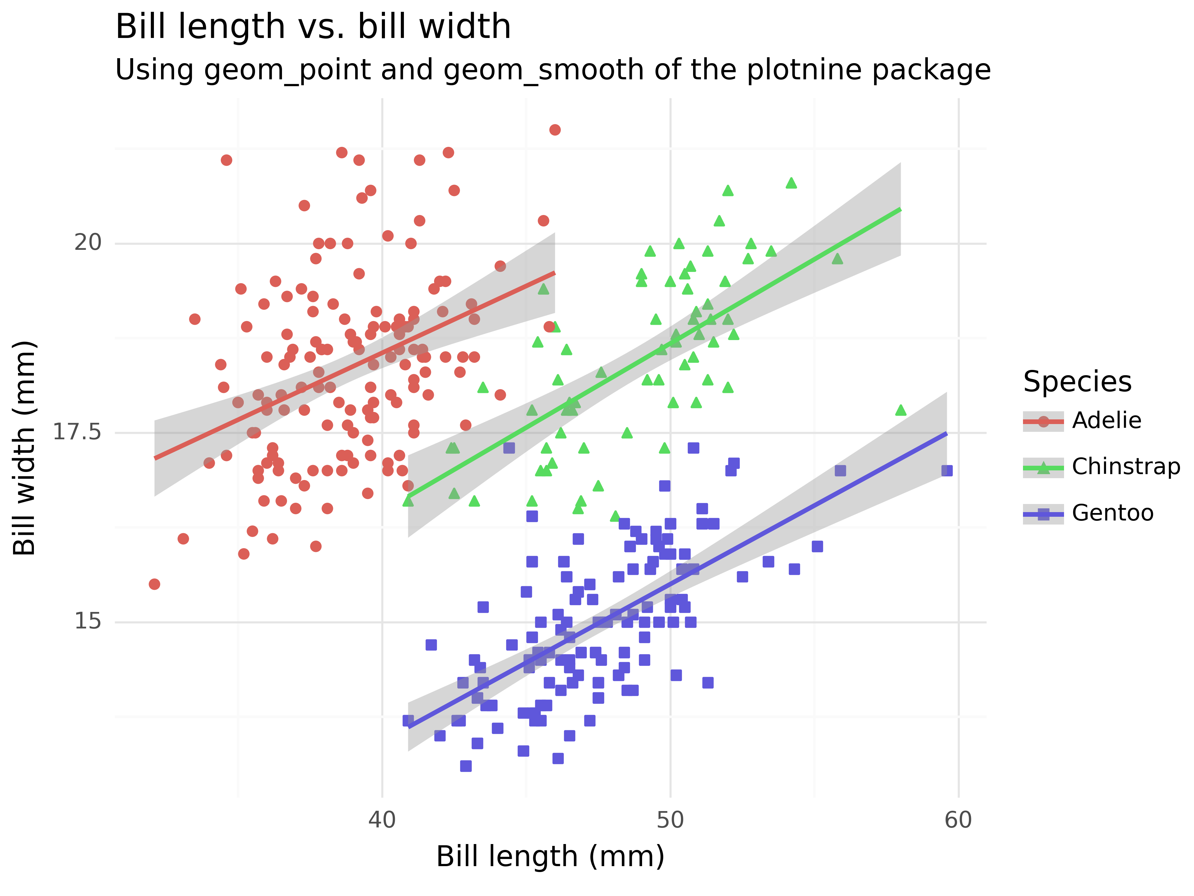
Visualizing distributions
A categorical variable
Let’s break down the similarity in smaller steps by focusing on simpler examples. If you have a categorical variable and want to compare its relevance in your data, then geom_bar() is your friend.
ggplot(penguins,
       aes(x = island)) +
  geom_bar()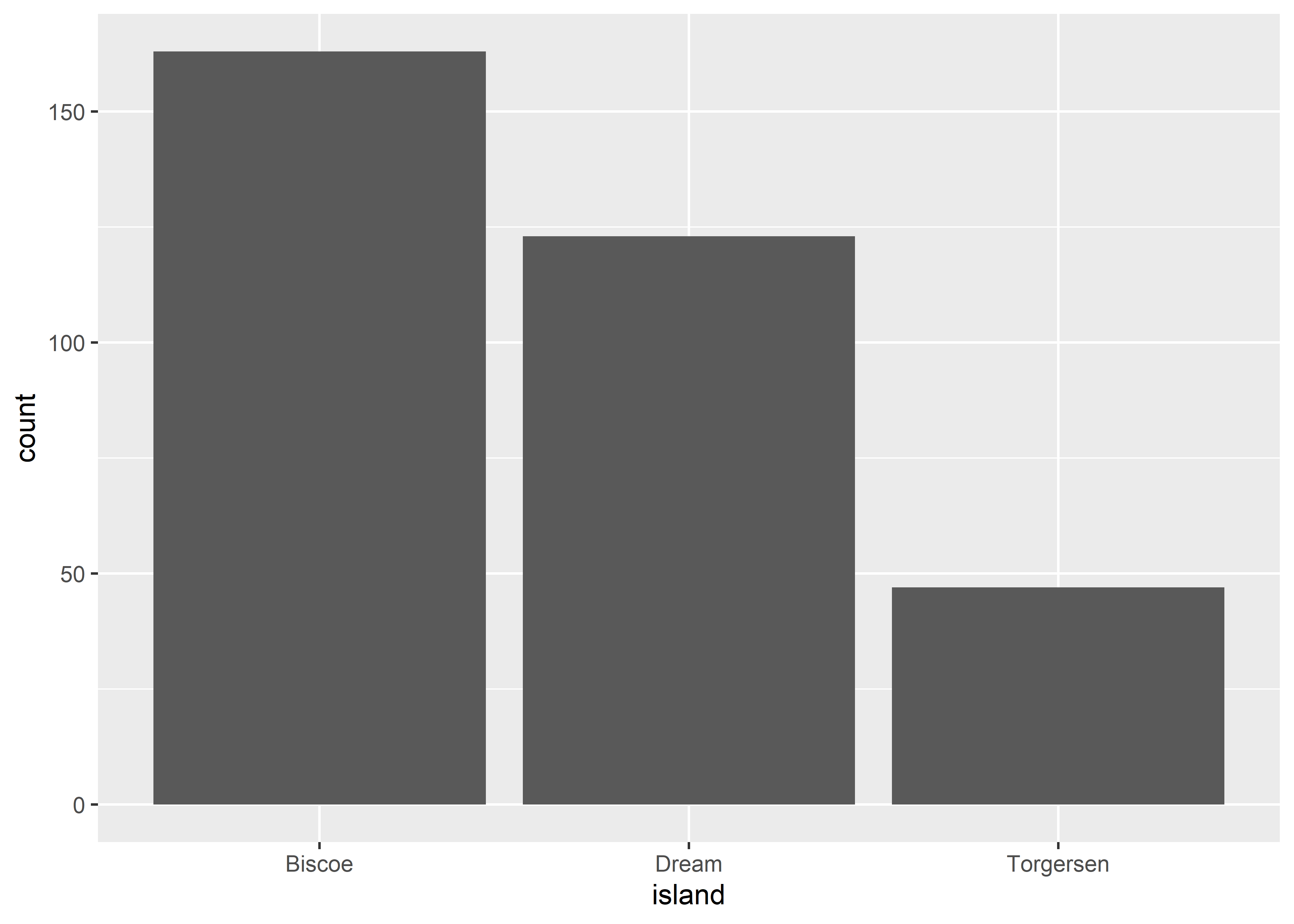
(ggplot(penguins,
        aes(x = "island"))
  + geom_bar()
)
<Figure Size: (640 x 480)>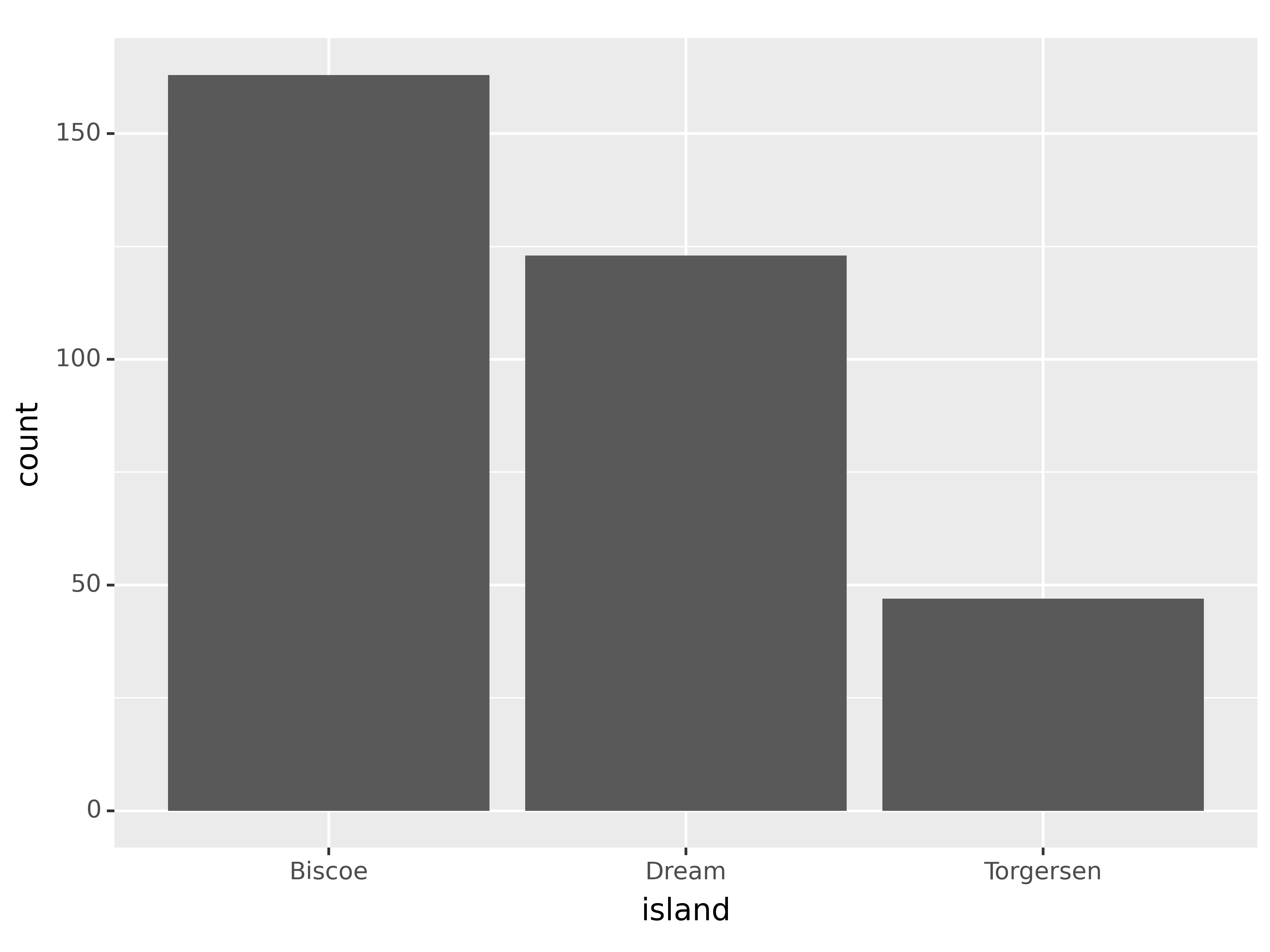
A numerical variable
If you have a numerical variable, usually histograms are a good starting point to get a better feeling for the distribution of your data. geom_histogram() with options to control bin widths or number of bins is the aesthetic for this task.
ggplot(penguins,
       aes(x = bill_length_mm)) +
  geom_histogram(binwidth = 2)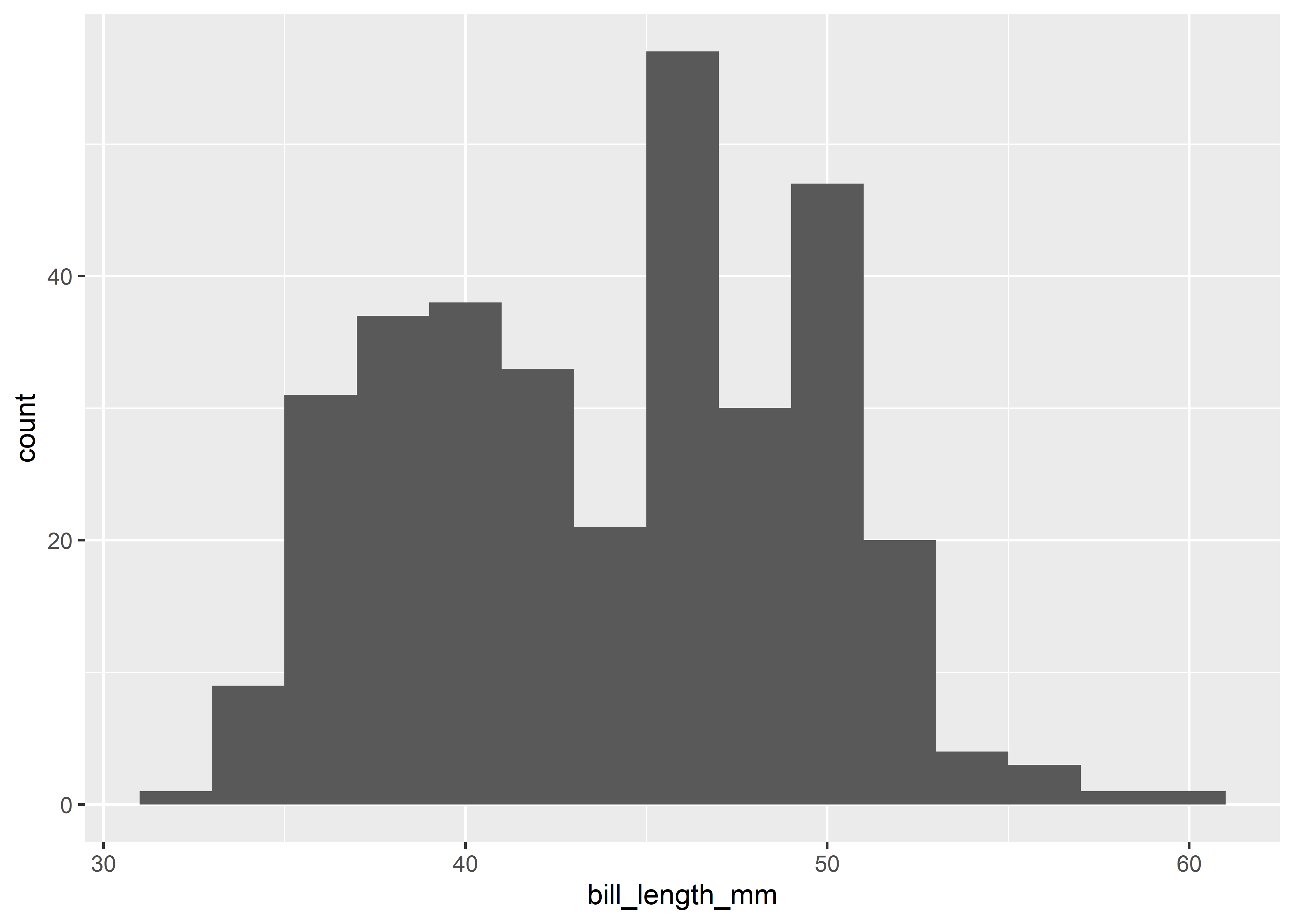
(ggplot(penguins,
       aes(x = "bill_length_mm"))
  + geom_histogram(binwidth = 2)
)
<Figure Size: (640 x 480)>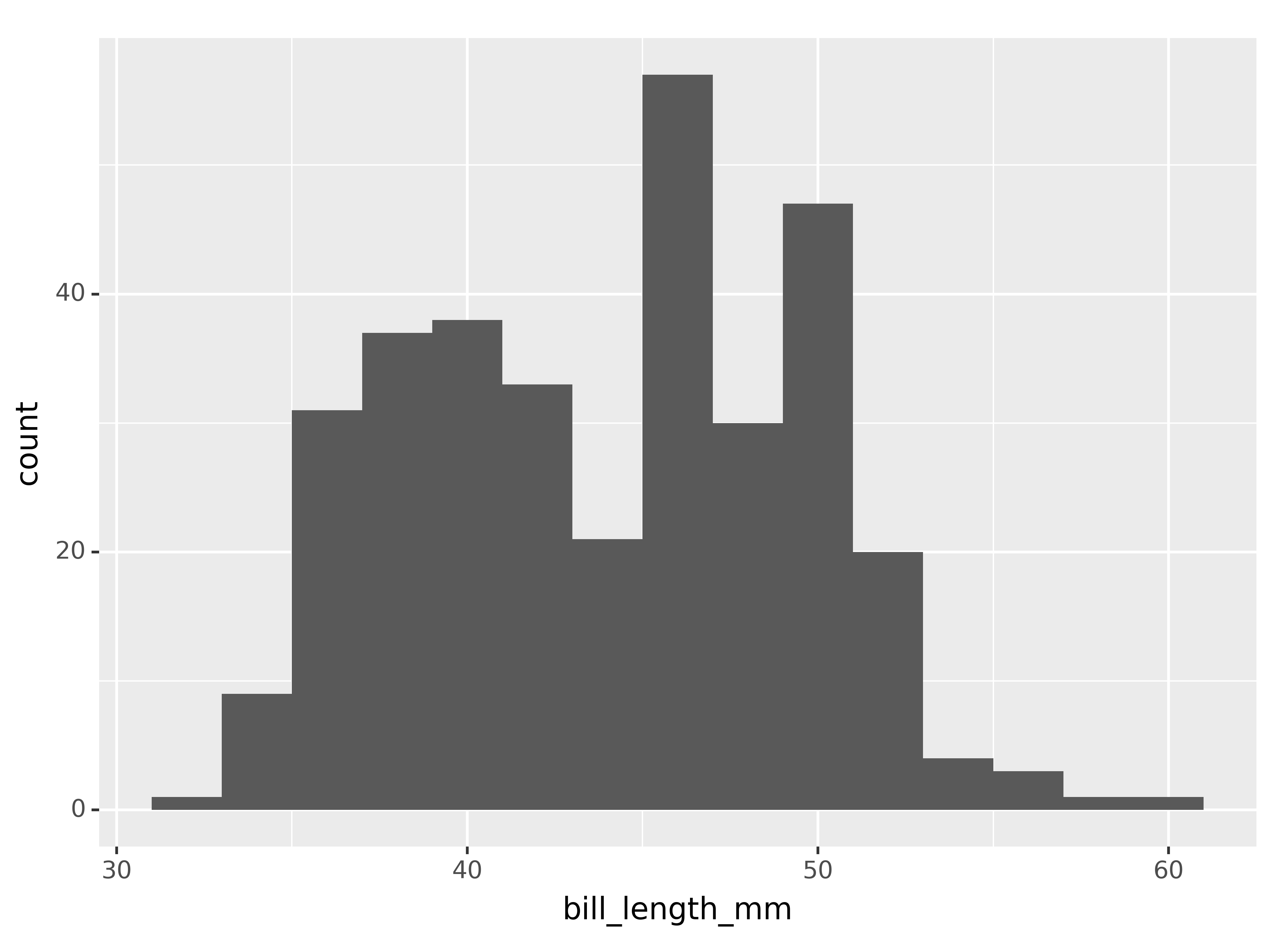
Both packages also support the geom_density() geom to plot density curves, but I personally wouldn’t recommend to start with densities because they are estimated curves that might obscure underlying data features. However, we look at densities in the next section.
Visualizing relationships
A numerical and a categorical variable
To visualize relationships, you need to have at least two columns. If you have a numerical and a categorical variable, then histograms or densities with groups are a good starting point. The next example illustrates the use of geom_density().
Note that plotnine still uses the historical size option and not the new linewidth wording (see this blog post here). Maybe this will change in the future, so keep an eye on this issue to stay up to date.
ggplot(penguins,
       aes(x = body_mass_g, color = species, fill = species)) +
  geom_density(linewidth = 0.75, alpha = 0.5)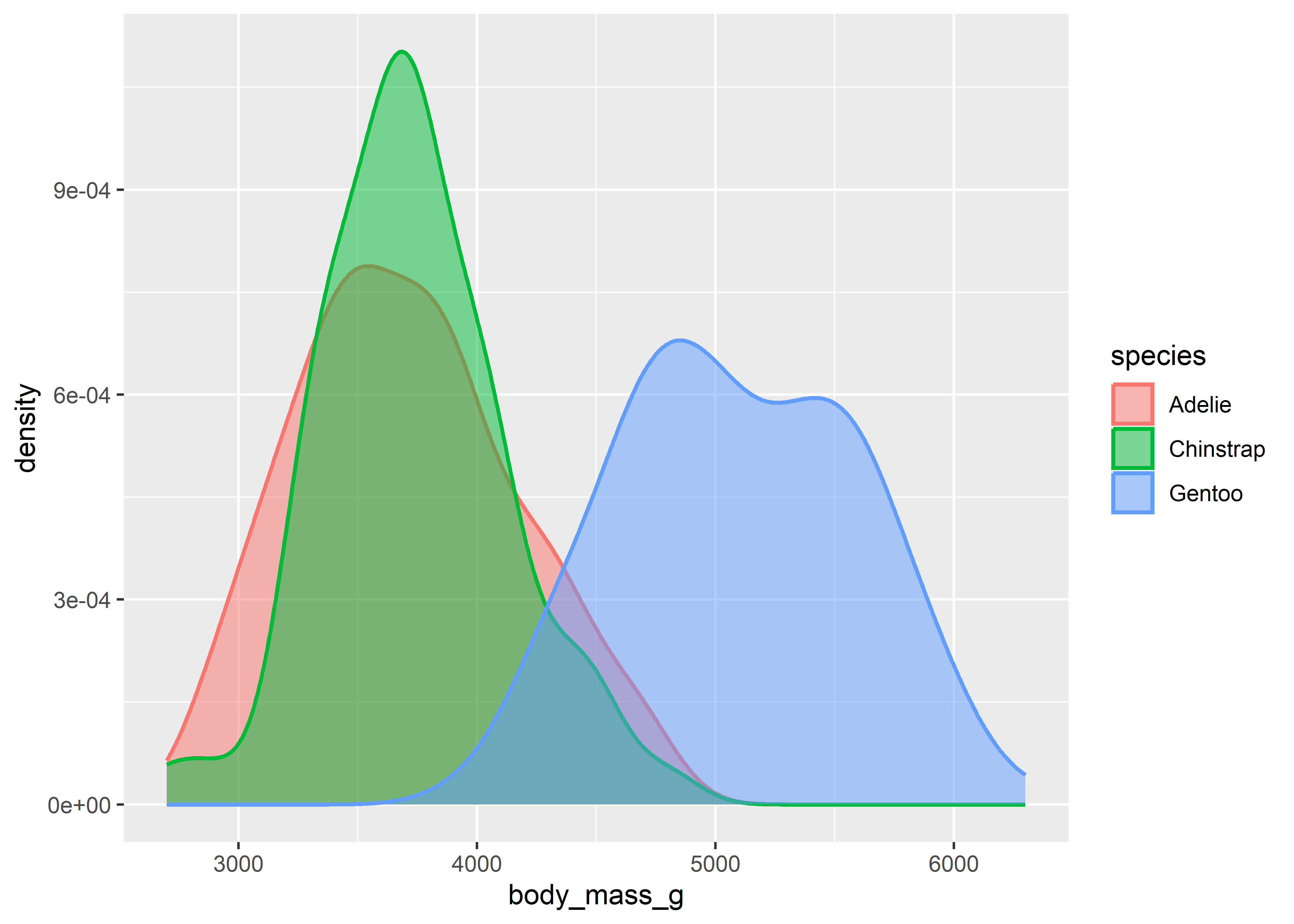
(ggplot(penguins,
       aes(x = "body_mass_g", color = "species", fill = "species"))
  + geom_density(size = 0.75, alpha = 0.5)
)
<Figure Size: (640 x 480)>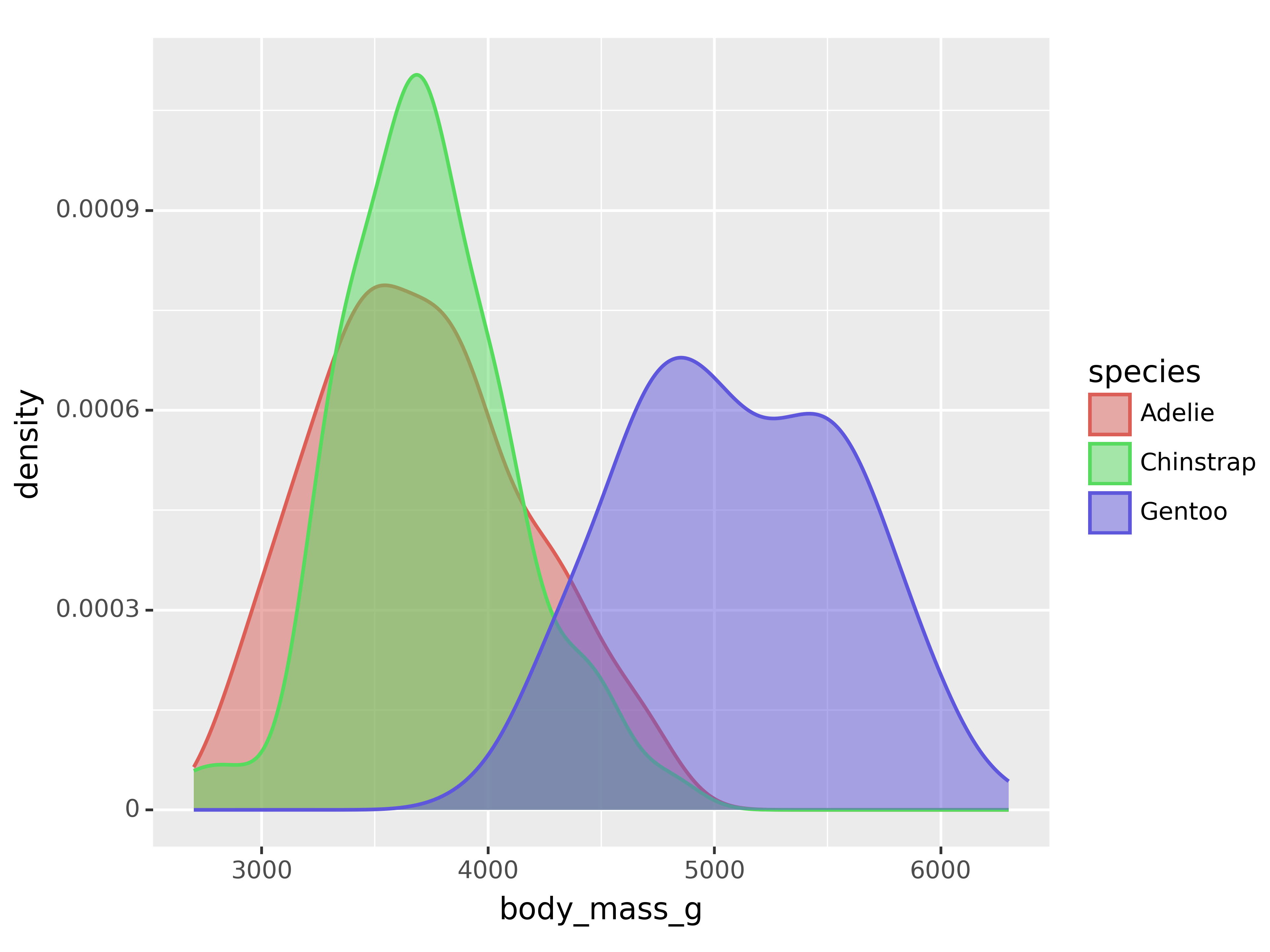
Two categorical columns
Stacked bar plots are a good way to display the relationship between two categorical columns. geom_bar() with the position argument is your aesthetic of choice for this task. Note that you can easily switch to counts by using position = "identity" instead of relative frequencies as in the example below.
ggplot(penguins, aes(x = species, fill = island)) +
  geom_bar(position = "fill")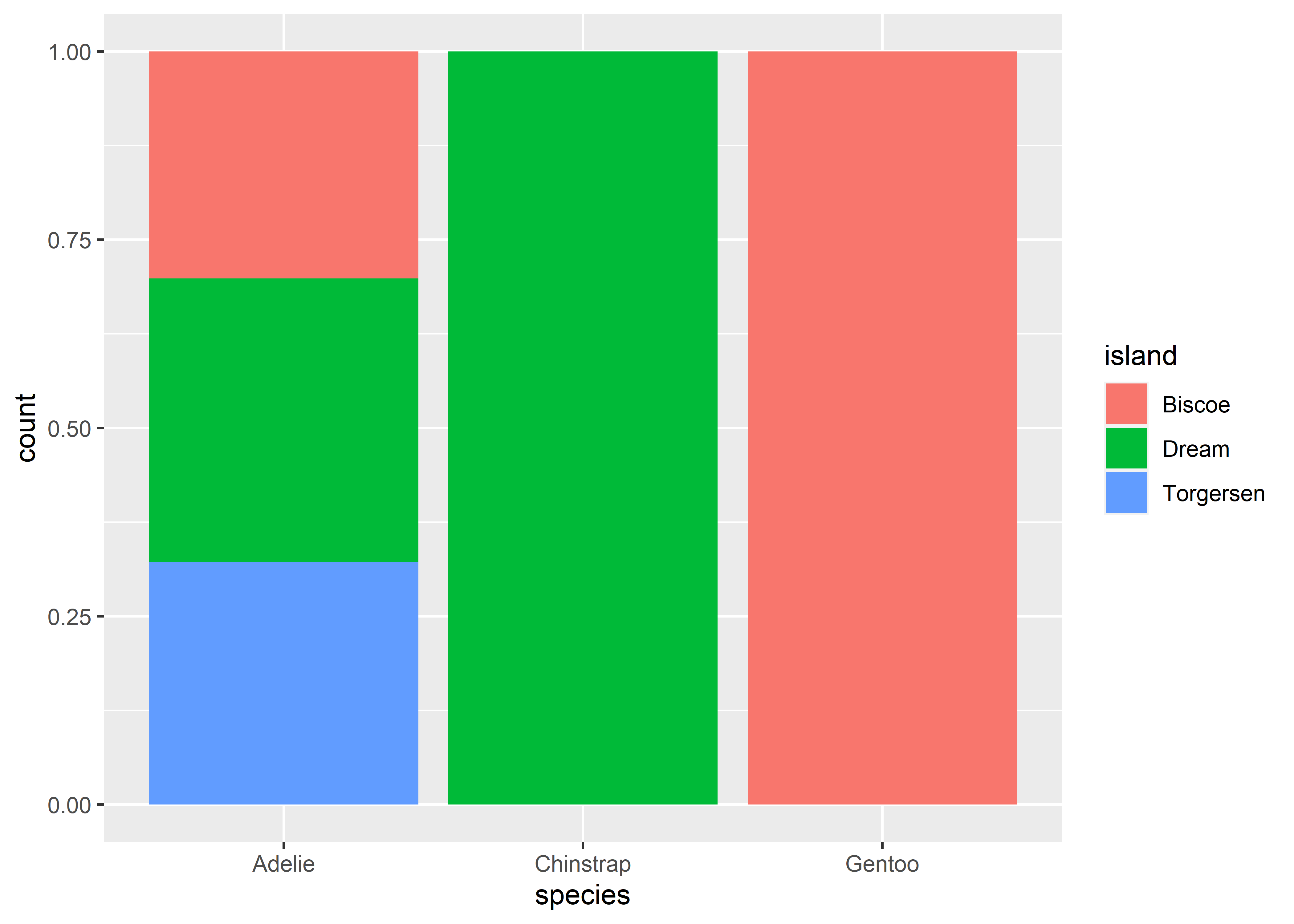
(ggplot(penguins, aes(x = "species", fill = "island"))
  + geom_bar(position = "fill")
)
<Figure Size: (640 x 480)>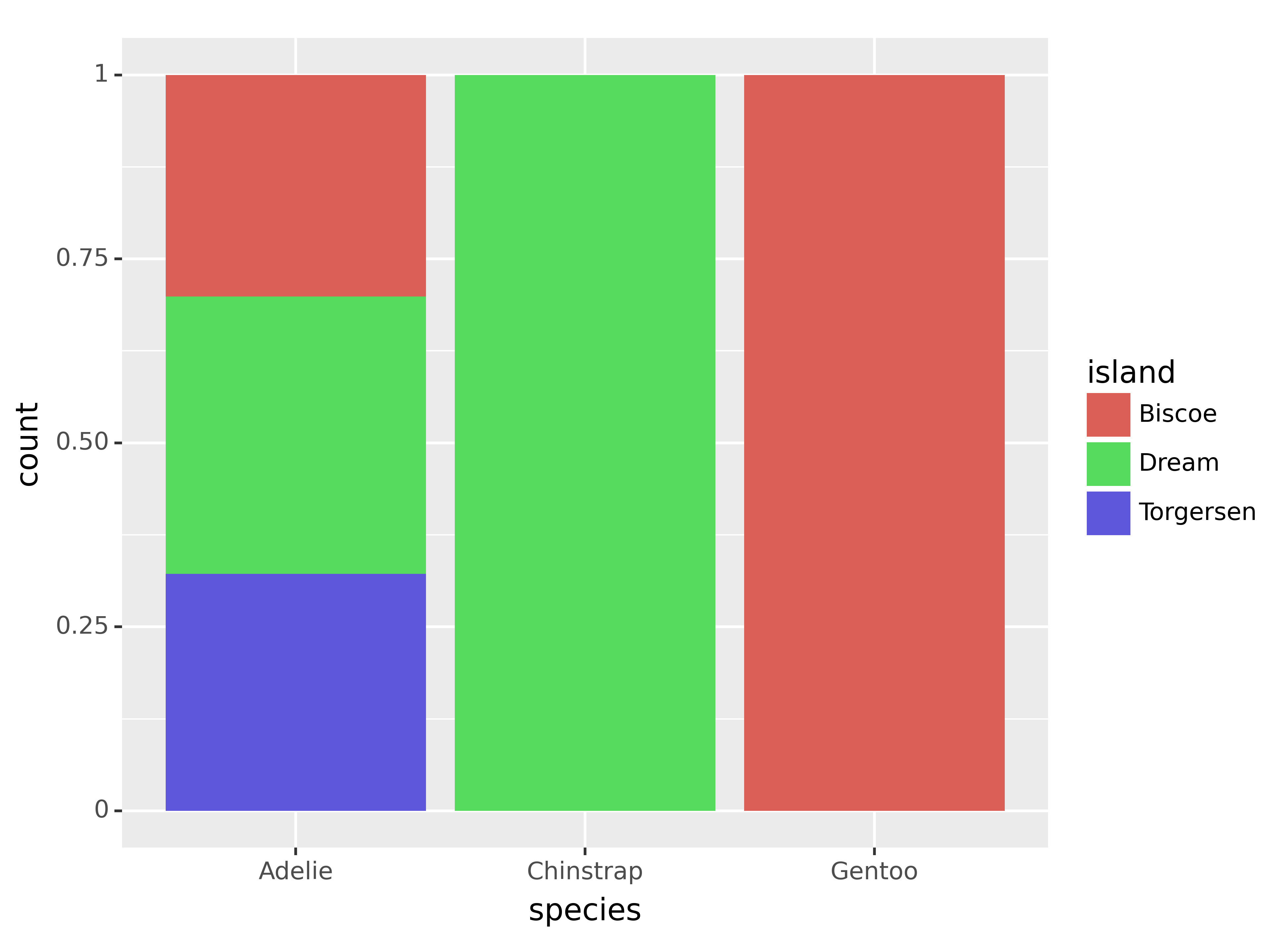
Two numerical columns
Scatter plots and regression lines are definitely the most common approach for visualizing the relationship between two numerical columns. Here, the size parameter controls the size of the shapes that you use for the data points. See the first visualization example if you want to see again how to add a regression line.
ggplot(penguins,
       aes(x = bill_length_mm, y = flipper_length_mm)) +
  geom_point(size = 2)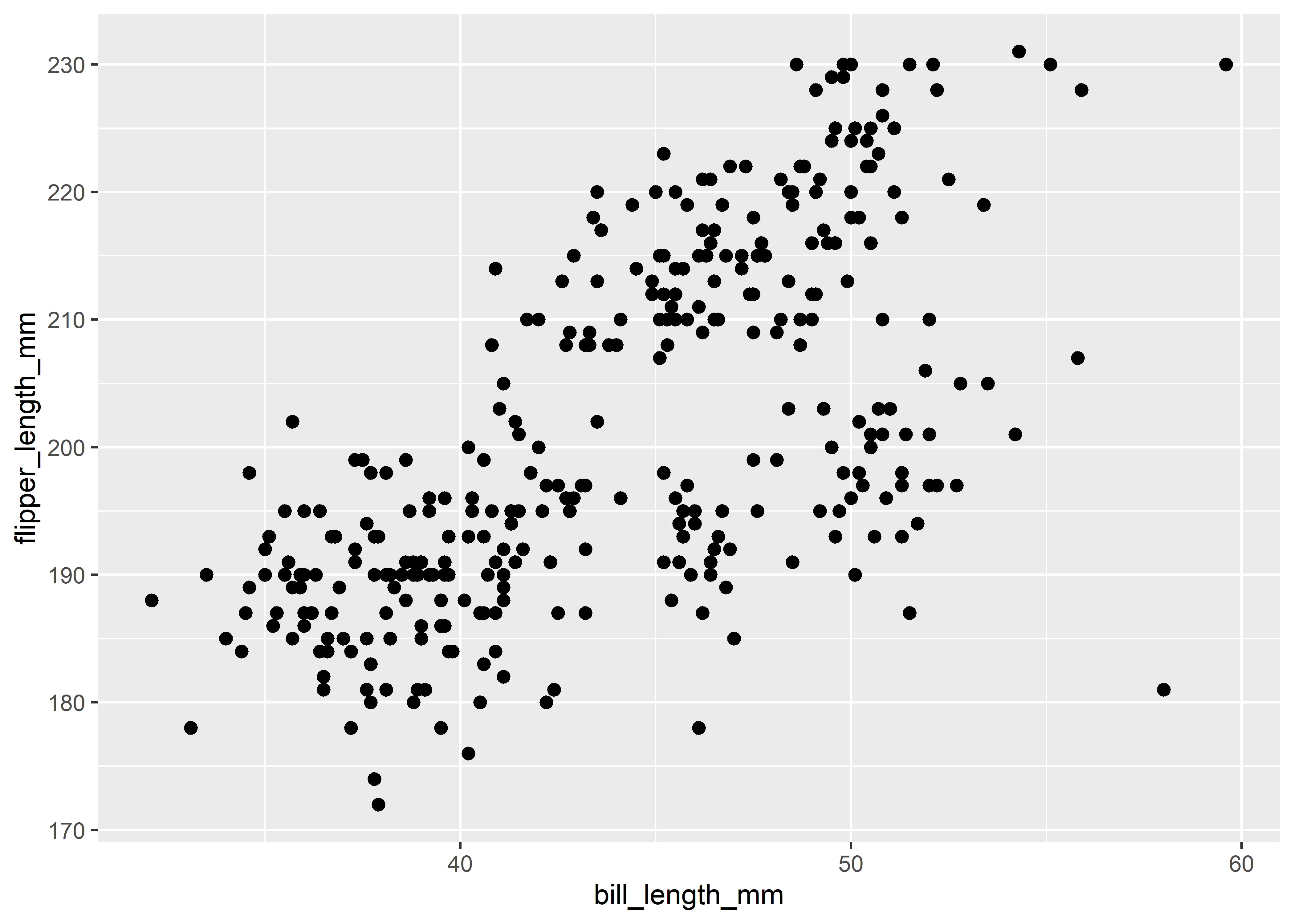
(ggplot(penguins,
        aes(x = "bill_length_mm", y = "flipper_length_mm"))
  + geom_point(size = 2)
)
<Figure Size: (640 x 480)>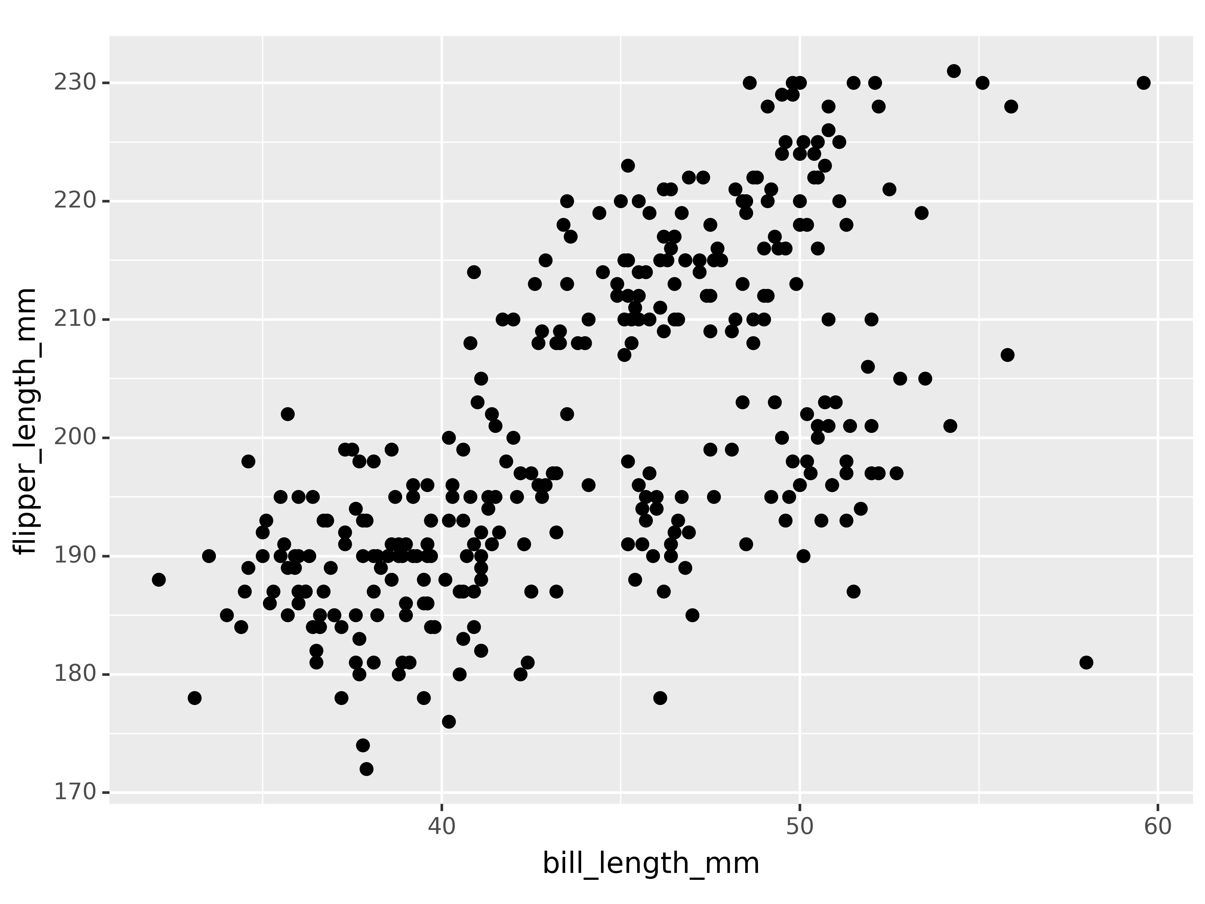
Three or more columns
You can include more information by mapping columns to additional aesthetics. For instance, we can map colors and shapes to species and create separate plots for each island by using facets. Facets are actually a great way to extend your figures, so I highly recommend playing around with them using your own data.
ggplot(penguins,
       aes(x = bill_length_mm, y = flipper_length_mm)) +
  geom_point(aes(color = species, shape = species)) +
  facet_wrap(~island)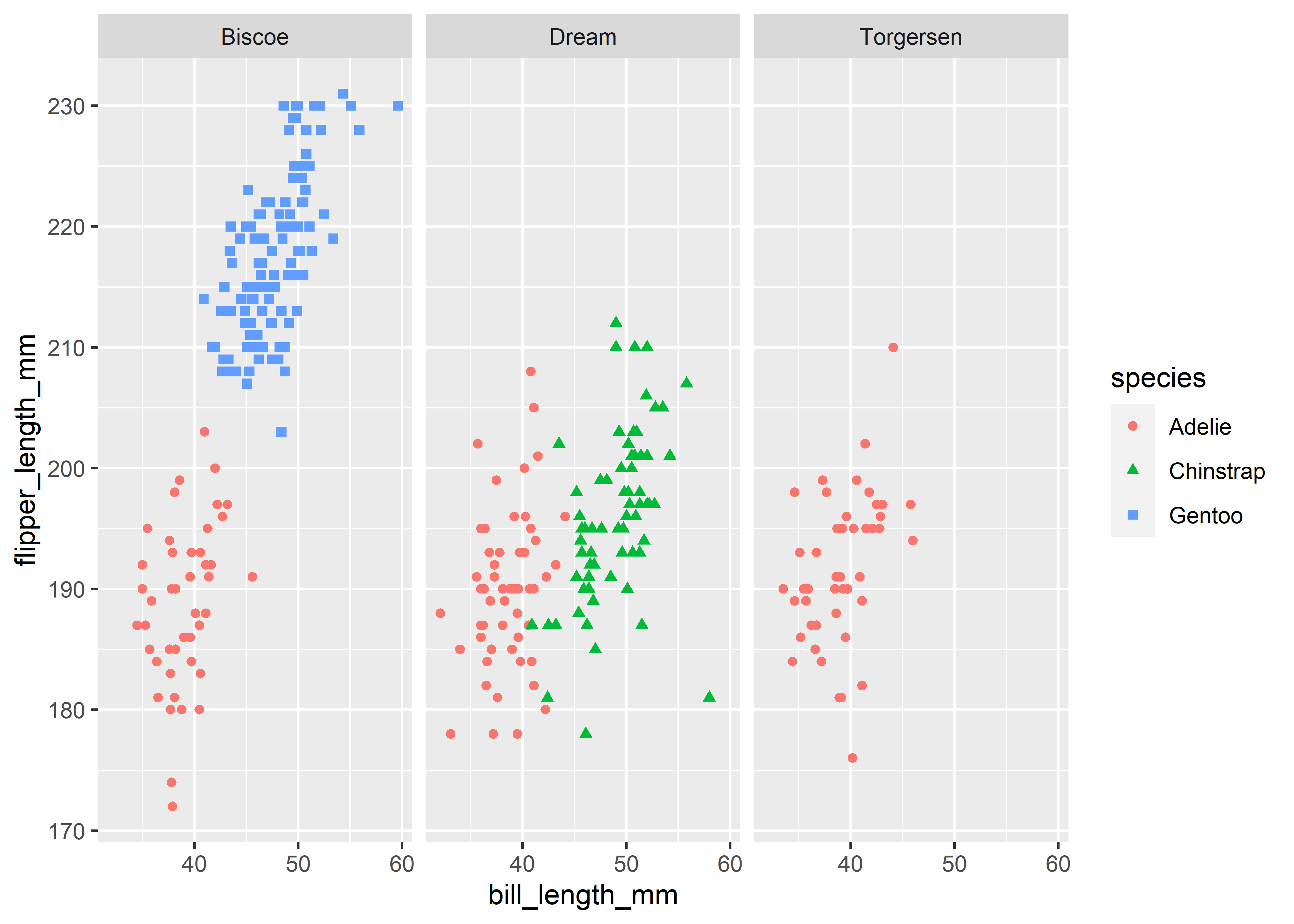
(ggplot(penguins,
       aes(x = "bill_length_mm", y = "flipper_length_mm"))
  + geom_point(aes(color = "species", shape = "species"))
  + facet_wrap("~island")
)
<Figure Size: (640 x 480)>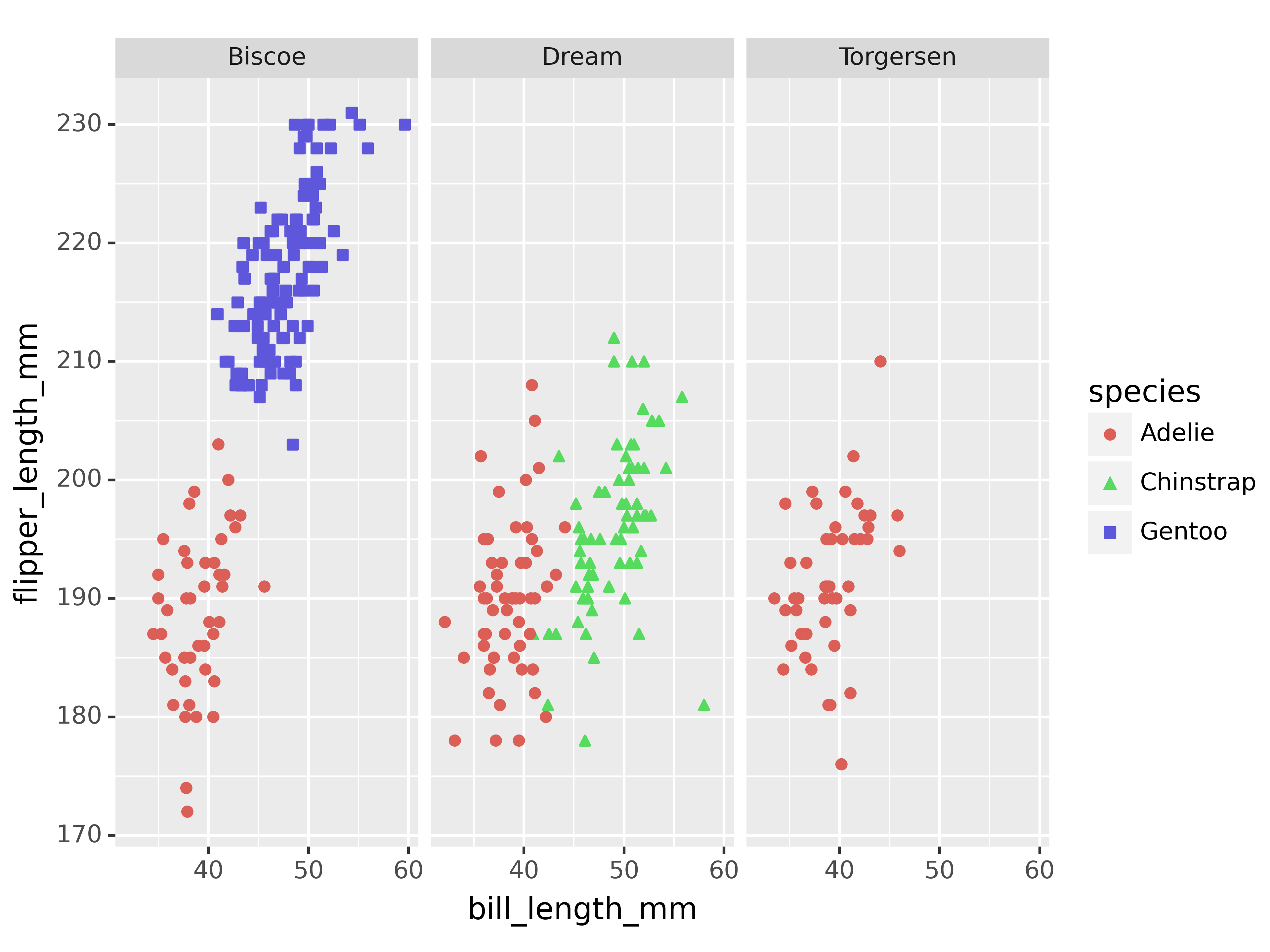
Saving plots
As a final comparison, let us look at saving plots. Again, the implementations are virtually the same across both packages with the same function name and corresponding options.
penguins_figure <- penguins |>
  ggplot(aes(x = bill_length_mm, y = flipper_length_mm)) +
  geom_point()

ggsave(penguins_figure, filename = "penguins-figure.png",
       width = 7, height = 5, dpi = 300)
penguins_figure = (
ggplot(penguins,
aes(x = "bill_length_mm", y = "flipper_length_mm"))
+ geom_point()
)
ggsave(penguins_figure, filename = "penguins-figure.png",
width = 7, height = 5, dpi = 300)Conclusion
In terms of syntax, ggplot2 and plotnine are remarkably similar, with minor differences primarily due to the differences between R and Python:
- Column references are implemented via strings in Python, while you can use unquoted column names in R due to its support of non-standard evaluation.
- The layer connector
+has to come at the end of the line R, not at the start. In Python, it makes more sense to have it at the start because you can comment out code better, but in principle also at the line end is possible.
The strongest argument in favor of ggplot2, however, is its large ecosystem of extension packages (see, for instance, this repo for a collection of links).
If you want to learn more about the power of the grammar of graphics, follow Cédric Scherer and check out his content. For instance, you can find his data visualization workshop notes from posit::conf(2022) here. Thomas Lin Pedersen also does fantastic things with ggplot2 among them creating generative art with code.