Tidy Data Manipulation: dplyr vs ibis
A comparison of R's dplyr and Python's ibis data manipulation packages
While I was traveling Japan earlier this year, I had the pleasure to experience sakura, the famous Japanese cherry blossoms. These blossoms are highly significant in Japanese culture, symbolizing the transient nature of life due to their brief blooming period. Sakura typically bloom in spring, from late March to early May, depending on the region. The blossoming of cherry trees is celebrated with hanami, a traditional custom of enjoying the beauty of flowers, often involving picnics under the blooming trees.
Climate change is causing sakura to bloom earlier and for shorter periods due to rising temperatures and shifting phenological patterns. This disrupts traditional hanami festivals, affects pollination success, and leads to regional variations in bloom timing, with urban areas often experiencing more pronounced shifts.
In this blog post, I visualize data with respect to cherry blossom blooming periods over regions and time. I provide a comprehensive guide on loading and preparing the corresponding data for analysis using both R and Python. The analysis spans from 1953 to 2023, leveraging the tidyverse family of packages for R and the ibis-framework for Python, complemented by plotnine for visualizations. I draw some inspiration from this blog post by Yuriko Schuhmacher. My primary focus is to transform and merge datasets detailing the first and full bloom dates of cherry blossoms and visualizing them by region.
For the R version, I rely on the tidyverse family of packages and list the required packages explicitly. For the Python version, I use ibis-framework for data manipulation (see my post on dplyr-vs-ibis for more information) and plotnine for visualizations.
library(dplyr)
library(tidyr)
library(readr)
library(lubridate)
library(ggplot2)
import ibis
from ibis import _
import ibis.selectors as s
from plotnine import *I use regional cherry blossom data between 1953 and 2023 from the Japan Meteorological Agency provided on Kaggle. There are two data sets: one table provides the dates when the cherry blossoms start blooming and the second table contains the dates when cherry blossoms reach full bloom. In the code below, I combine both to a long format table with additional columns that indicate the day of the year with full bloom and the days between first and full bloom, respectively.
sakura_first_bloom_dates <- read_csv("data/sakura_first_bloom_dates.csv")
sakura_full_bloom_dates <- read_csv("data/sakura_full_bloom_dates.csv")

first_bloom_long <- sakura_first_bloom_dates |>
  select(-`30 Year Average 1981-2010`, -Notes) |>
  rename(location = `Site Name`, is_currently_observed = `Currently Being Observed`) |>
  pivot_longer(`1953`:`2023`, names_to = "year", values_to = "first_bloom")

full_bloom_long <- sakura_full_bloom_dates |>
  select(-`30 Year Average 1981-2010`, -Notes) |>
  rename(location = `Site Name`, is_currently_observed = `Currently Being Observed`) |>
  pivot_longer(`1953`:`2023`, names_to = "year", values_to = "full_bloom")

sakura_dates <- first_bloom_long |>
  full_join(full_bloom_long, c("location", "year", "is_currently_observed")) |>
  mutate(year = as.integer(year),
         days_to_full_bloom = as.integer(full_bloom - as.Date(paste(year, "-01-01", sep = ""))),
         days_from_first_to_full_bloom = as.integer(full_bloom - first_bloom))
sakura_first_bloom_dates = ibis.read_csv("data/sakura_first_bloom_dates.csv")
sakura_full_bloom_dates = ibis.read_csv("data/sakura_full_bloom_dates.csv")
first_bloom_long = (sakura_first_bloom_dates
.drop("30 Year Average 1981-2010", "Notes")
.rename(location = "Site Name", is_currently_observed = "Currently Being Observed")
.pivot_longer(s.r["1953":"2023"], names_to = "year", values_to = "first_bloom")
)
full_bloom_long = (sakura_full_bloom_dates
.drop("30 Year Average 1981-2010", "Notes")
.rename(location = "Site Name", is_currently_observed = "Currently Being Observed")
.pivot_longer(s.r["1953":"2023"], names_to = "year", values_to = "full_bloom")
)
sakura_dates = (first_bloom_long.outer_join(full_bloom_long, ["location", "year", "is_currently_observed"])
.select(~s.contains("_right"))
.mutate(year = _.year.cast("int32"))
.mutate(days_to_full_bloom = (_.full_bloom - ibis.date(_.year.cast('string') + '-01-01')).cast('interval("D")').cast("int32"),
days_from_first_to_full_bloom=(_.full_bloom - _.first_bloom).cast('interval("D")').cast("int32")
)
)I next add regions that I later use to group the locations. I used a list of regions from Wikipedia as input and let ChatGPT label the locations accordingly. You can find the resulting mapping on GitHub.
locations_regions <- read_csv("data/locations_region.csv")

southern_islands <- c("Naze", "Ishigaki Island", "Miyakojima", "Naha", "Minami Daito Island")

locations_regions <- locations_regions |>
  mutate(region = if_else(location %in% southern_islands, "Ryukyu Islands", region))
locations_regions = ibis.read_csv("data/locations_region.csv")
southern_islands = ["Naze", "Ishigaki Island", "Miyakojima", "Naha", "Minami Daito Island"]
locations_regions = (locations_regions
.mutate(
region = ibis.case().when(_.location.isin(southern_islands), "Ryukyu Islands").else_(_.region).end()
)
)Before we move on to visualizations, let’s add the regions to the sakura dates and keep only regions that are still currently observed and with valid full bloom days and days between first and full bloom. In addition, I drop year 1953 to have exactly 70 years of data. Finally, I want to order the regions from north to south.
sakura_data <- sakura_dates |>
  left_join(locations_regions, join_by(location)) |>
  filter(is_currently_observed == TRUE &
          year >= 1954 &
          !is.na(days_to_full_bloom) &
          !is.na(days_from_first_to_full_bloom))

sakura_data <- sakura_data |>
  mutate(region = factor(region, levels = c("Hokkaidō", "Honshū", "Kyūshū", "Shikoku", "Ryukyu Islands")))
Since ibis-framework does not support factor variables, we have to use pandas here.
sakura_data = (sakura_dates
  .left_join(locations_regions, "location")
  .filter([_.is_currently_observed == True,
           _.year >= 1954,
           _.days_to_full_bloom.notnull(),
           _.days_from_first_to_full_bloom.notnull()])
)

import pandas as pd
sakura_data = sakura_data.to_pandas()
sakura_data["region"] = pd.Categorical(sakura_data["region"], categories = ["Hokkaidō", "Honshū", "Kyūshū", "Shikoku", "Ryukyu Islands"], ordered = True)I set the theme and colors for the figures below on a global level. Note that setting the figure size in the theme works best for plotnine, while ggplot2 uses the paramters defined in the YAML header of the .qmd file underlying this post.
theme_set(theme_classic(base_size = 16, base_family = "SF Pro"))

theme_update(
  panel.grid.minor = element_blank(),
  panel.grid.major = element_blank(),
  strip.text = element_text(size = 16),
  strip.background = element_blank(),
  axis.title.x = element_blank(),
  axis.title.y = element_blank(),
  axis.ticks = element_blank(),
  axis.line = element_blank()
)

colors <- c("#ffb7c5", "#A0522D")
breaks_year <- seq(1950, 2030, by = 20)
Since plotnine is built on matplotlib, setting the font family can be done more flexibly and consistently using the latter’s font manager.
import matplotlib.pyplot as plt
import matplotlib.font_manager as fm

fpath = "/Library/Fonts/SF-Pro.ttf"

fm.fontManager.addfont(fpath)
prop = fm.FontProperties(fname = fpath)
font_name = prop.get_name()
plt.rcParams["font.family"] = font_name

theme_set(theme_classic(base_size = 16) + theme(figure_size = (12, 8)))

theme_update(
  panel_grid_minor = element_blank(),
  panel_grid_major = element_blank(),
  strip_text = element_text(size = 16),
  strip_background = element_blank(),
  axis_title_x = element_blank(),
  axis_title_y = element_blank(),
  axis_ticks = element_blank(),
  axis_line = element_blank()
)

colors = ["#ffb7c5", "#A0522D"]
breaks_year = range(1950, 2031, 20)The first figure visually represents the full bloom days of cherry blossoms across various regions in Japan over time. Each point on the plot shows the bloom day for a specific year. The line indicates the general trend over time. The regions are separated into individual panels arranged in a single row, allowing for easy comparison. The subtitle highlights a key finding: cities in the northern regions, such as Hokkaidō and Honshū, tend to have earlier bloom dates compared to those in the Ryukyu Islands, which experience later blooms.
sakura_data |>
  ggplot(aes(x = year, y = days_to_full_bloom)) +
  geom_point(color = colors[1], alpha = 0.9, size = 4, shape = 21, fill = "white") +
  geom_smooth(method = "loess", se = FALSE,
              color = colors[2], linewidth = 2) +
  facet_wrap(~region, nrow = 1) +
  labs(title = "Day of the year with peak cherry tree blossom for regions in Japan since 1954",
       subtitle = "Cities in northern regions Hokkaidō and Honshū exhibit earlier full blooms, while Ryukyu Islands even later",
       x = NULL, y = NULL) +
  scale_x_continuous(breaks = breaks_year) +
  scale_y_continuous(breaks = seq(30, 150, by = 30))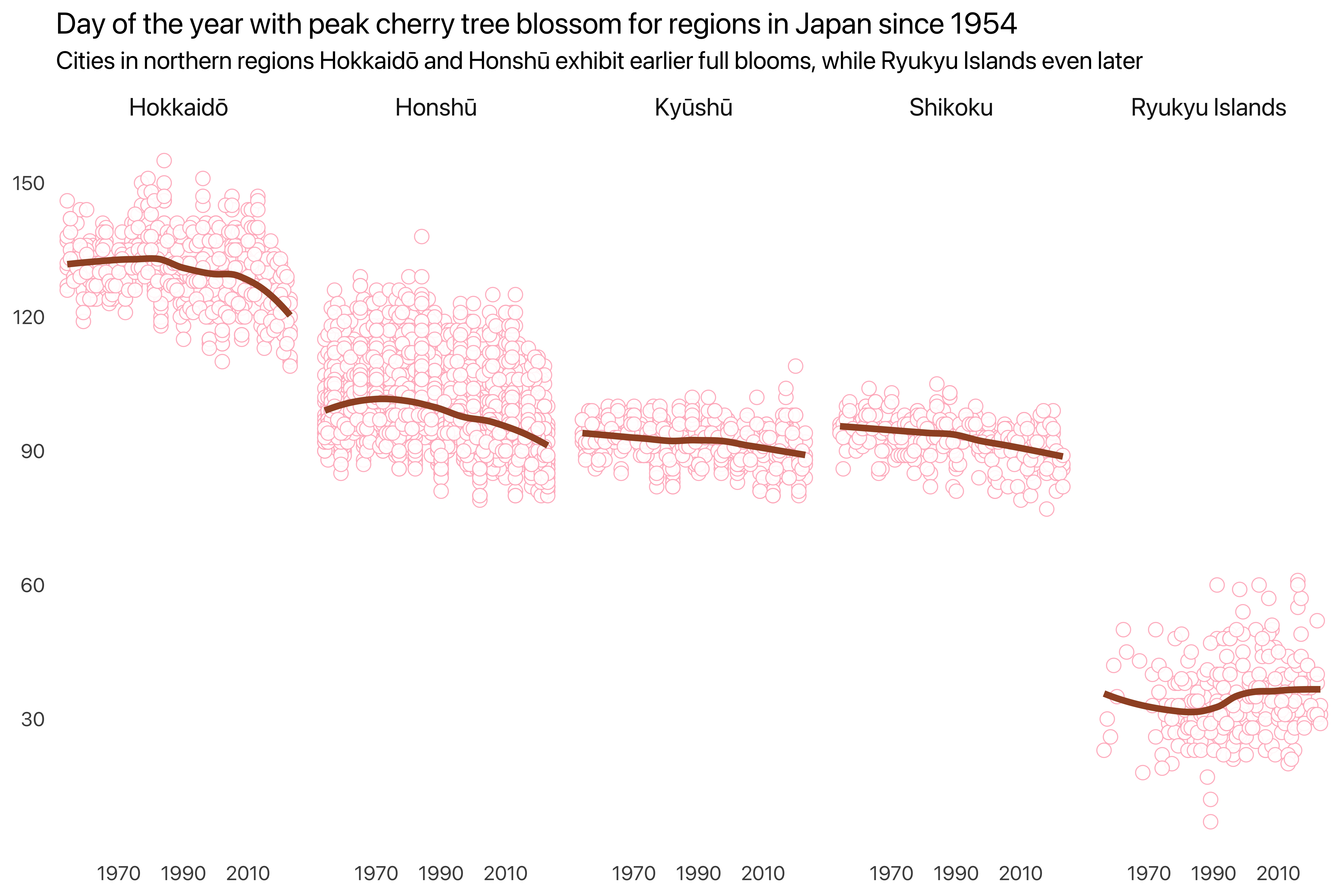
Note that linewidth is still size in plotnine.
(ggplot(sakura_data,
         aes(x = "year", y = "days_to_full_bloom"))
  + geom_point(color = colors[0], alpha = 0.9, size = 4, shape = "o", fill = "white")
  + geom_smooth(method = "loess", se = False,
                color = colors[1], size = 2)
  + facet_wrap("~region", nrow = 1)
  + labs(title = "Day of the year with peak cherry tree blossom for regions in Japan since 1954",
         subtitle = "Cities in northern regions Hokkaidō and Honshū exhibit earlier full blooms, while Ryukyu Islands even later",
         x = None, y = None)
  + scale_x_continuous(breaks = breaks_year)
  + scale_y_continuous(breaks = range(30, 151, 30))
)
<Figure Size: (1200 x 800)>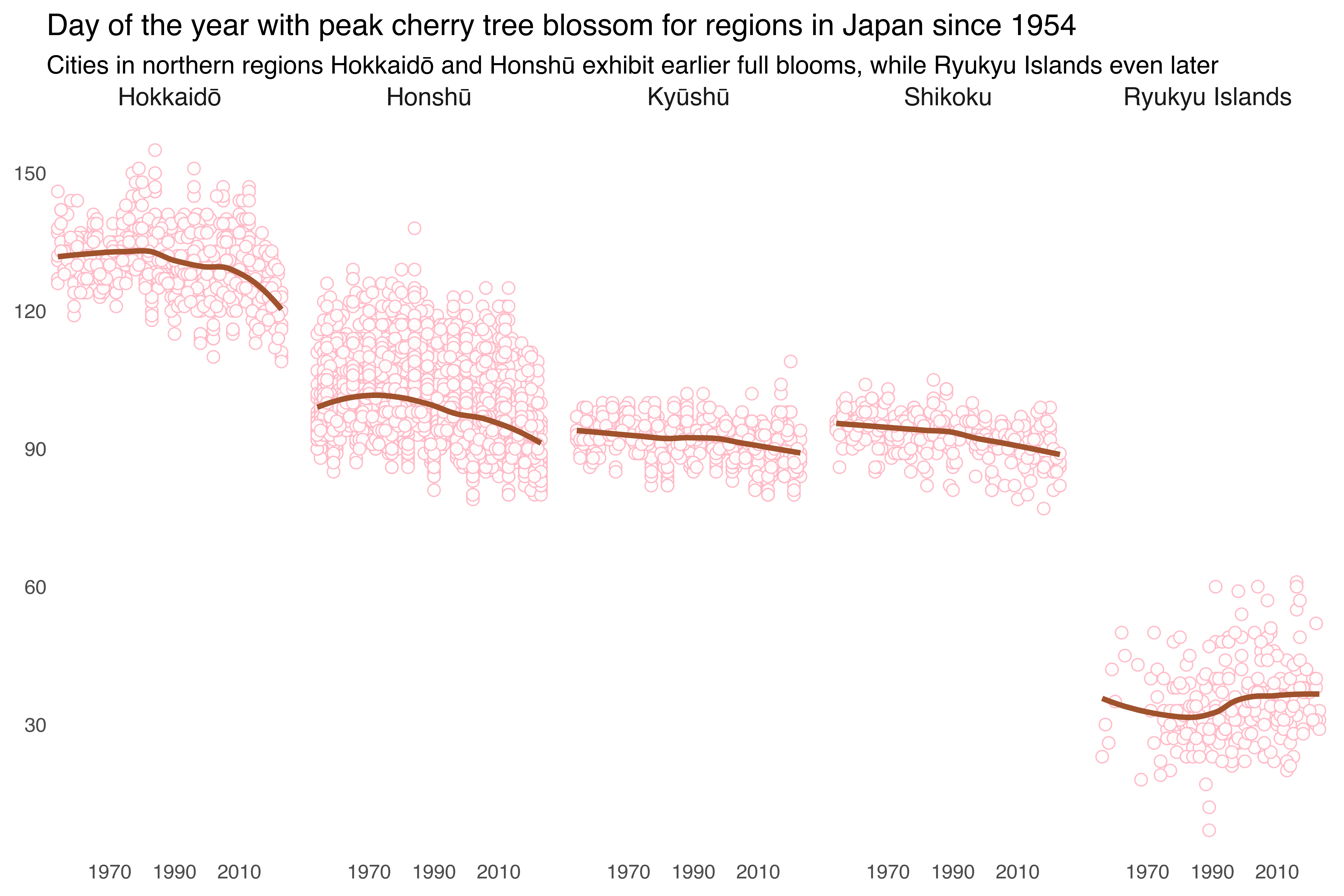
The next figure illustrates the duration between the initial opening of cherry blossoms and their peak bloom across different regions in Japan over time. Each point represents the number of days for a given year. The linear line highlights the overall trends in blooming duration. The regions are individually faceted in a single row, enabling side-by-side comparisons. The figure shows that Hokkaidō has the shortest and decreasing periods between blossom opening and peak bloom, while regions like Kyūshū and Ryukyu exhibit increasing durations.
sakura_data |>
  ggplot(aes(x = year, y = days_from_first_to_full_bloom)) +
  geom_point(color = colors[1], alpha = 0.9, size = 4, shape = 21, fill = "white") +
  geom_smooth(method = "loess", se = FALSE,
              color = colors[2], linewidth = 2) +
  facet_wrap(~region, nrow = 1) +
  labs(title = "Days from blossoms opening to peak bloom for regions in Japan since 1954",
       subtitle = "Hokkaidō exhibits the shortest and decreasing blooming periods, while Kyūshū's and Ryukyu's have lengthened",
       x = NULL, y = NULL) +
  scale_x_continuous(breaks = breaks_year)
Note that point shape in plotnine are according to matplotlib.markers, see the list here.
(ggplot(sakura_data,
        aes(x = "year", y = "days_from_first_to_full_bloom"))
  + geom_point(color = colors[0], alpha = 0.9, size = 4, shape = "o", fill = "white")
  + geom_smooth(method = "loess", se = False,
                color = colors[1], size = 2)
  + facet_wrap("~region", nrow = 1)
  + labs(title = "Days from blossoms opening to peak bloom for regions in Japan since 1954",
         subtitle = "Hokkaidō exhibits the shortest and decreasing blooming periods, while Kyūshū's and Ryukyu's have lengthened",
          x = None, y = None)
  + scale_x_continuous(breaks = breaks_year)
)
<Figure Size: (1200 x 800)>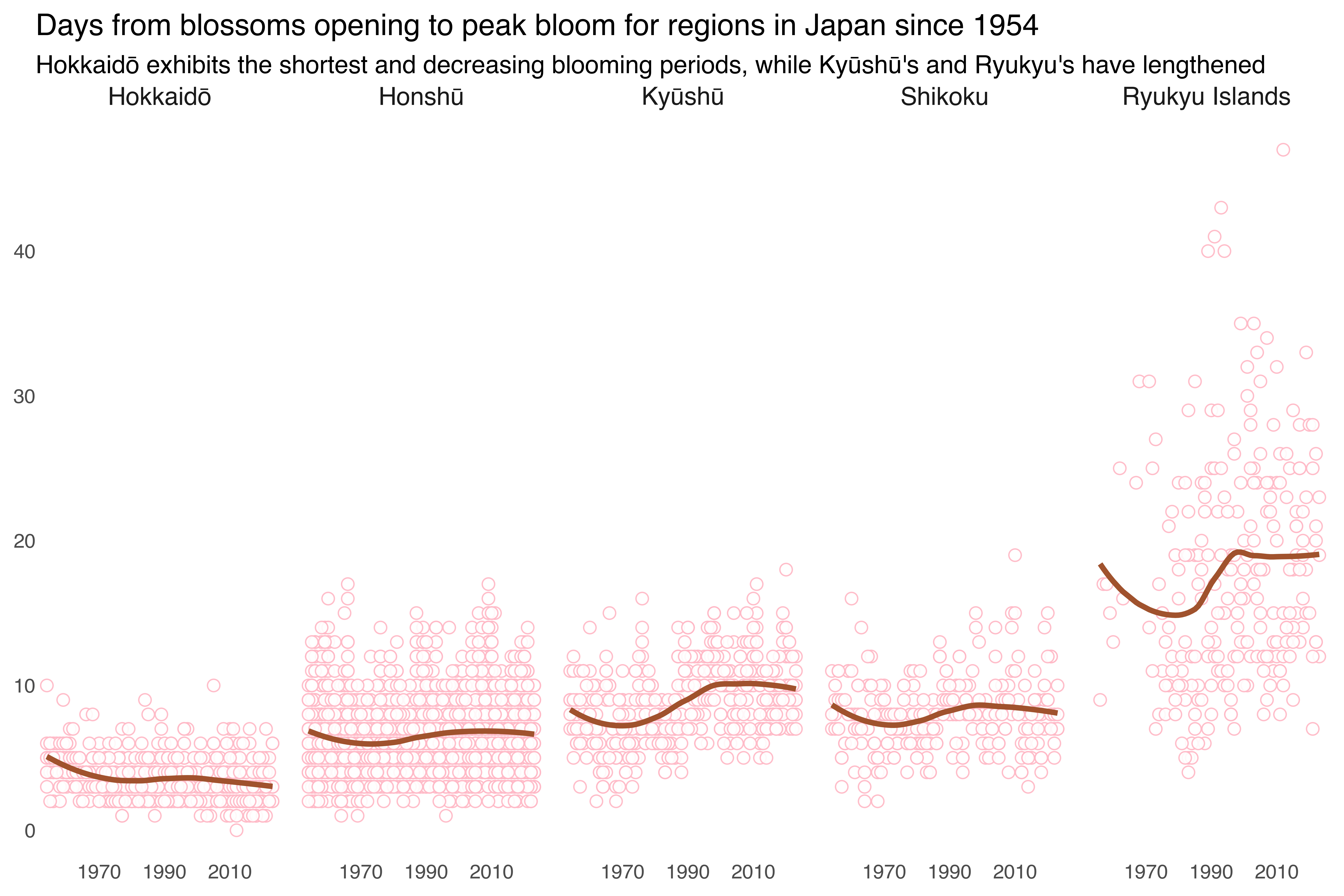
The post includes detailed code snippets for both R and Python, ensuring that readers can follow along regardless of their preferred programming language. I think it is remarkable how similar R and Python syntax can be these days.
It would be great to include the daily average temperature in each year as an additional variable for the visualizations (e.g. color intensity of point color) to tackle the question of missing variables that explain the changes. However, for the purpose of this post, it seemed to much work to download the regional temperatures using the unintuitive and restrictive interface of the Japanese Meterological Agency (JMA). If anybody can point me to an alternative data source, I’m happy to include the temperature changes as well!