Tidy Data Visualization: ggplot2 vs seaborn
A comparison of two popular data visualization tools for R and Python
ggplot2 is based on Leland Wilkinson”s Grammar of Graphics, a set of principles for creating consistent and effective statistical graphics, and was developed by Hadley Wickham. The package is a cornerstone of the R community and integrates seamlessly with other tidyverse packages. One of the key strengths of ggplot2 is its use of a consistent syntax, making it relatively easy to learn and enabling users to create a wide range of graphics with a common set of functions. The package is also highly customizable, allowing detailed adjustments to almost every element of a plot.
matplotlib is a widely-used data visualization library in Python, renowned for its ability to produce high-quality graphs and charts. Rooted in an imperative programming style, matplotlib provides a detailed control over plot elements, making it possible to fine-tune the aesthetics and layout of graphs to a high degree. Its compatibility with a variety of output formats and integration with other data science libraries like numpy and pandas makes it a cornerstone in the Python scientific computing stack.
The types of plots that I chose for the comparison heavily draw on the examples given in R for Data Science - an amazing resource if you want to get started with data visualization.
We start by loading the main packages of interest and the popular penguins data that exists as packages for both . We then use the penguins data frame as the data to compare all functions and methods below. Note that I drop all rows with missing values because I don’t want to get into related messages in this post.
library(dplyr)
library(ggplot2)
library(palmerpenguins)

penguins <- na.omit(palmerpenguins::penguins)
import pandas as pd
import numpy as np
import matplotlib.pyplot as plt
from palmerpenguins import load_penguins
penguins = load_penguins().dropna()Let”s start with an advancved example that combines many different aesthetics at the same time: we plot two columns against each other, use color and shape aesthetics do differentiate species, include separate regression lines for each species, manually set nice labels, and use a theme. As you can see in this example already, ggplot2 and matplotlib have a fundamentally different syntactic approach. While ggplot2 works with layers and easily allows the creation of regression lines for each species, you have to use a loop to get the same results with matplotlib. We also can see the difference between the declarative and imperative programming styles.
ggplot(penguins,
       aes(x = bill_length_mm, y = bill_depth_mm,
           color = species, shape = species)) +
  geom_point(size = 2) +
  geom_smooth(method = "lm", formula = "y ~ x") +
  labs(x = "Bill length (mm)", y = "Bill width (mm)",
       title = "Bill length vs. bill width",
       subtitle = "Using geom_point and geom_smooth of the ggplot2 package",
       color = "Species", shape = "Species") +
  theme_minimal()
species_unique = sorted(penguins["species"].unique())
markers = ["o", "s", "^"]
colors = ["red", "green", "blue"]

for species, marker, color in zip(species_unique, markers, colors):
  species_data = penguins[penguins["species"] == species]
  plt.scatter(
    species_data["bill_length_mm"], species_data["bill_depth_mm"],
    s = 50, alpha = 0.7, label = species, marker = marker, color = color
  )

  X = species_data["bill_length_mm"]
  Y = species_data["bill_depth_mm"]
  m, b = np.polyfit(X, Y, 1)
  plt.plot(X, m*X + b, color = color)

plt.xlabel("Bill length (mm)")
plt.ylabel("Bill width (mm)")
plt.title("Bill length vs. bill width")
plt.legend(title = "Species")

plt.show()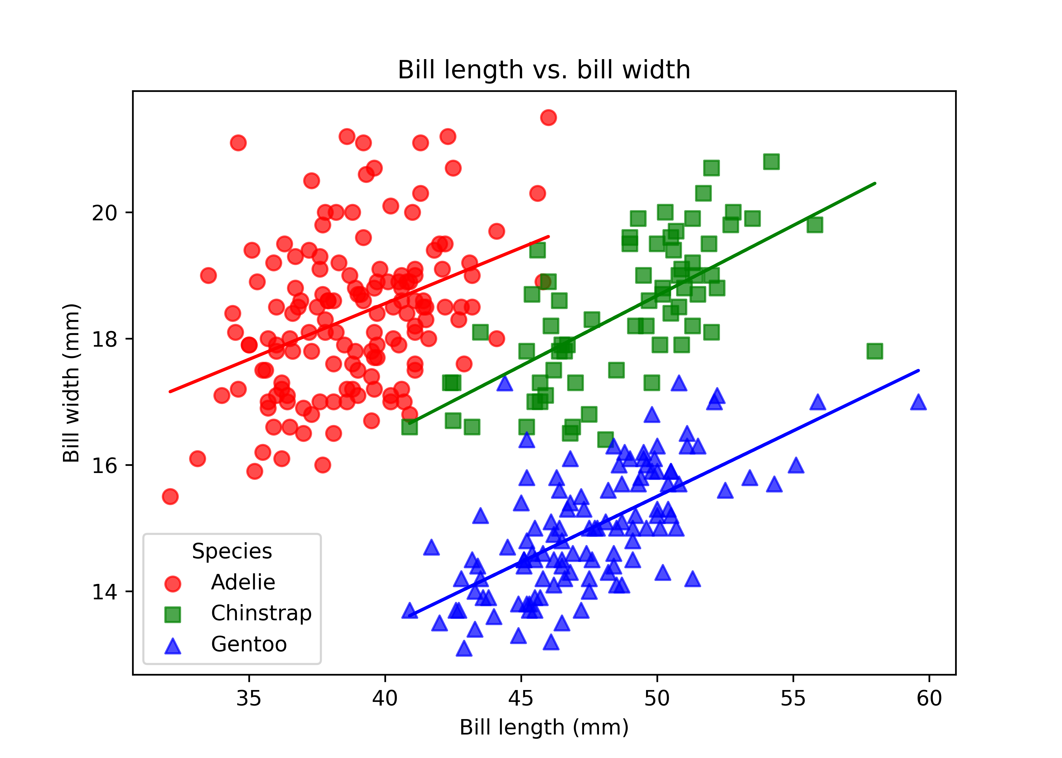
Let’s break down the differences in smaller steps by focusing on simpler examples. If you have a categorical variable and want to compare its relevance in your data, then ggplot2::geom_bar() and matplotlib.bar() are your friends. I manually specify the order and values in the matplotlib figure to mimic the automatic behavior of ggplot2.
ggplot(penguins,
       aes(x = island)) +
  geom_bar()
categorical_variable = penguins["island"].value_counts()
plt.bar(categorical_variable.index, categorical_variable.values)

plt.show()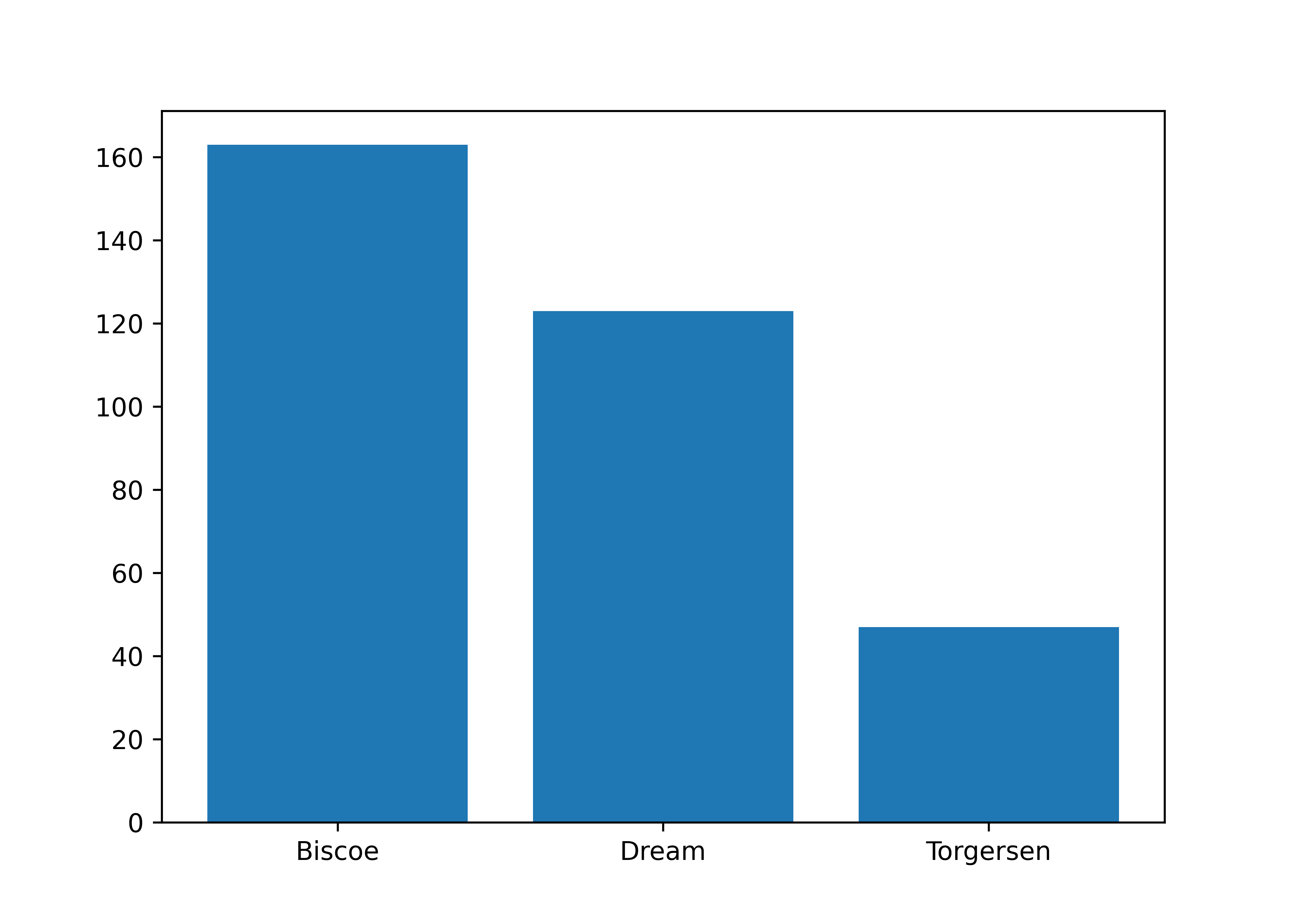
If you have a numerical variable, usually histograms are a good starting point to get a better feeling for the distribution of your data. ggplot2::geom_histogram() and matplotlib.hist with options to control bin widths or number of bins are the functions for this task. Note that you have to manually compute the range of values for matplotlib.
ggplot(penguins,
       aes(x = bill_length_mm)) +
  geom_histogram(binwidth = 2)
numerical_variable = penguins["bill_length_mm"].dropna()
plt.hist(numerical_variable,
         bins = range(int(numerical_variable.min()),
                      int(numerical_variable.max()) + 2, 2))

plt.show()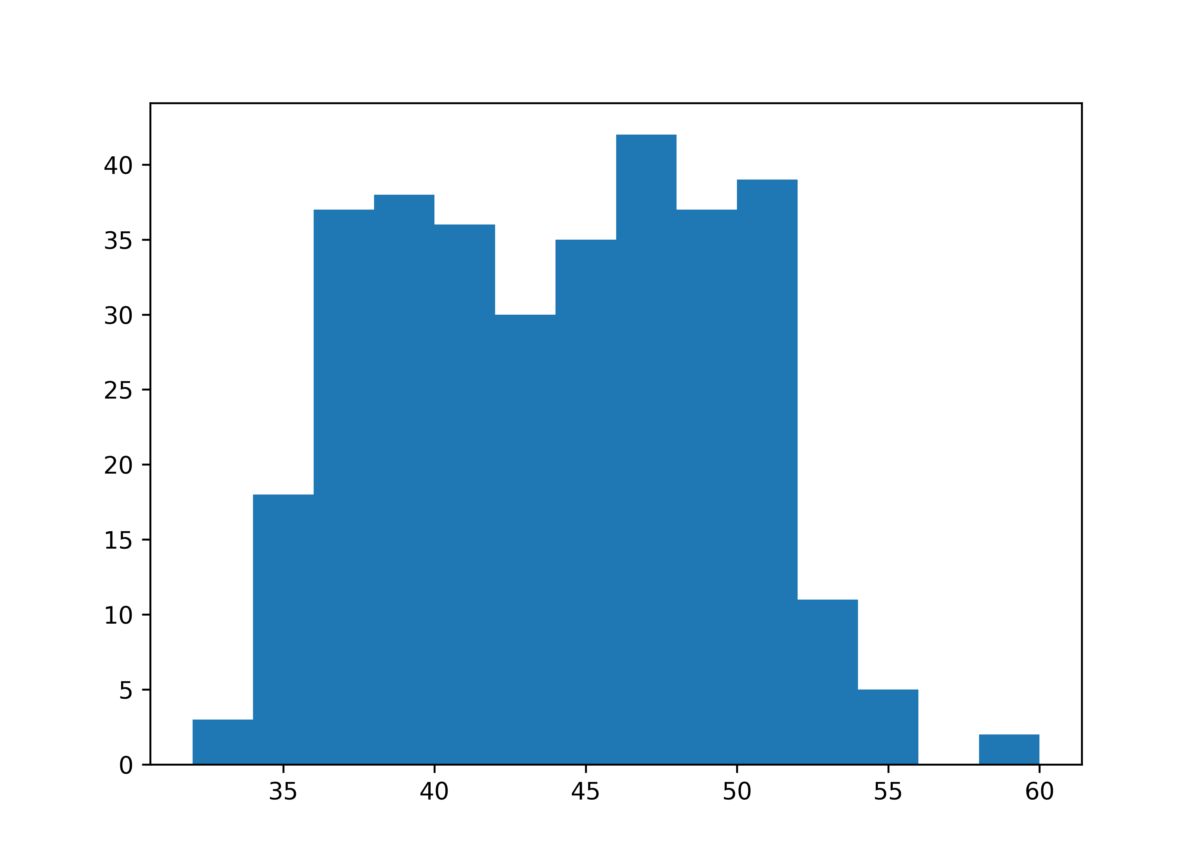
Both packages also support density curves, but I personally wouldn”t recommend to start with densities because they are estimated curves that might obscure underlying data features. However, we look at densities in the next section.
To visualize relationships, you need to have at least two columns. If you have a numerical and a categorical variable, then histograms or densities with groups are a good starting point. The next example illustrates the use of density curves via ggplot2::geom_density(). In matplotlib, we have to manually estimate the densities and plot the corresponding lines in a loop. Visually, we get quite similar results.
ggplot(penguins,
       aes(x = body_mass_g, color = species, fill = species)) +
  geom_density(linewidth = 0.75, alpha = 0.5)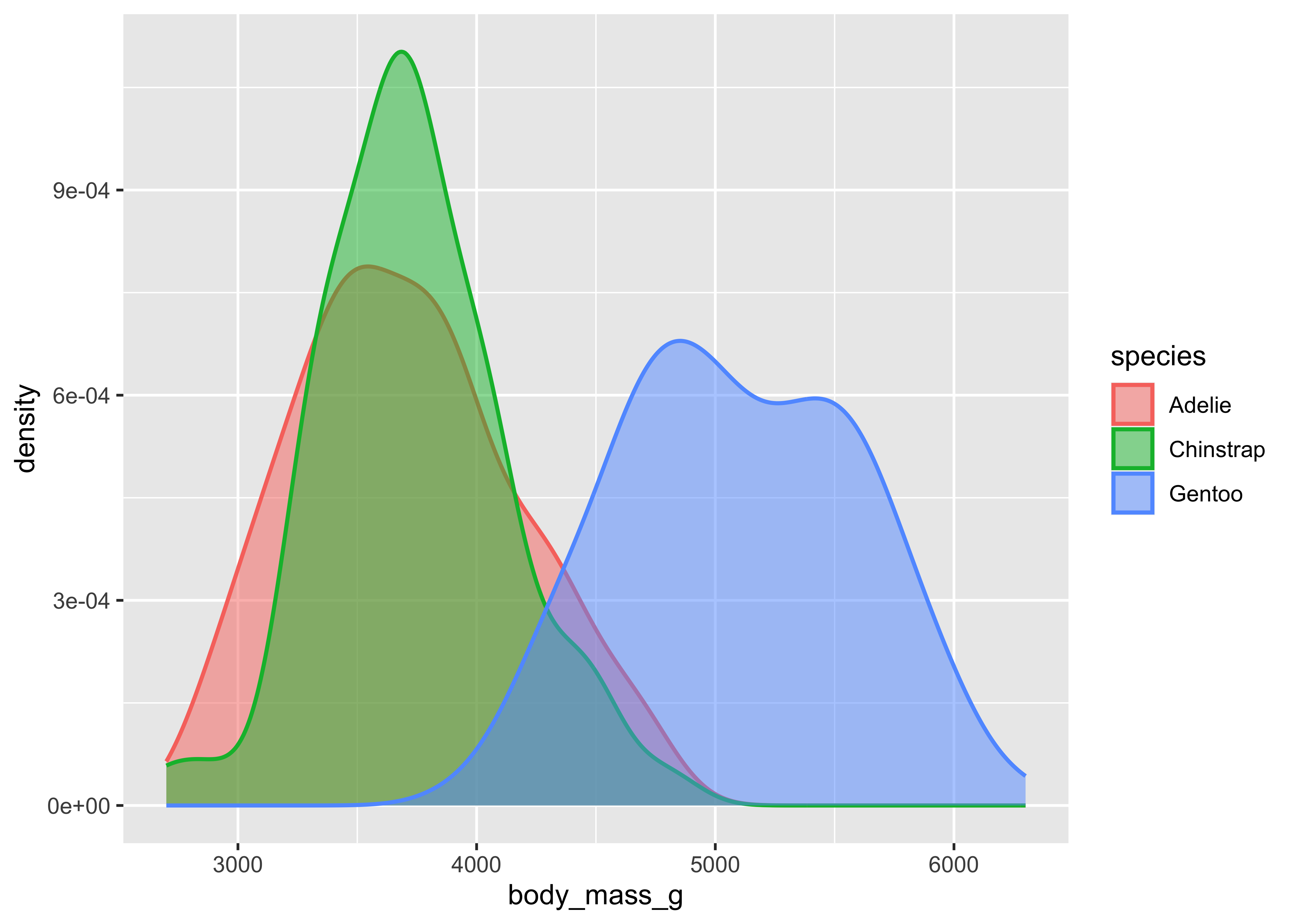
from scipy.stats import gaussian_kde

species_list = penguins["species"].unique()

for species in species_list:

  species_data = penguins[penguins["species"] == species]["body_mass_g"]

  density = gaussian_kde(species_data)
  xs = np.linspace(species_data.min(), species_data.max(), 200)
  density.covariance_factor = lambda : .25
  density._compute_covariance()

  plt.plot(xs, density(xs), lw = 0.75, label = species)
  plt.fill_between(xs, density(xs), alpha = 0.5)

plt.xlabel("body_mass_g")
plt.ylabel("density")
plt.legend()

plt.show()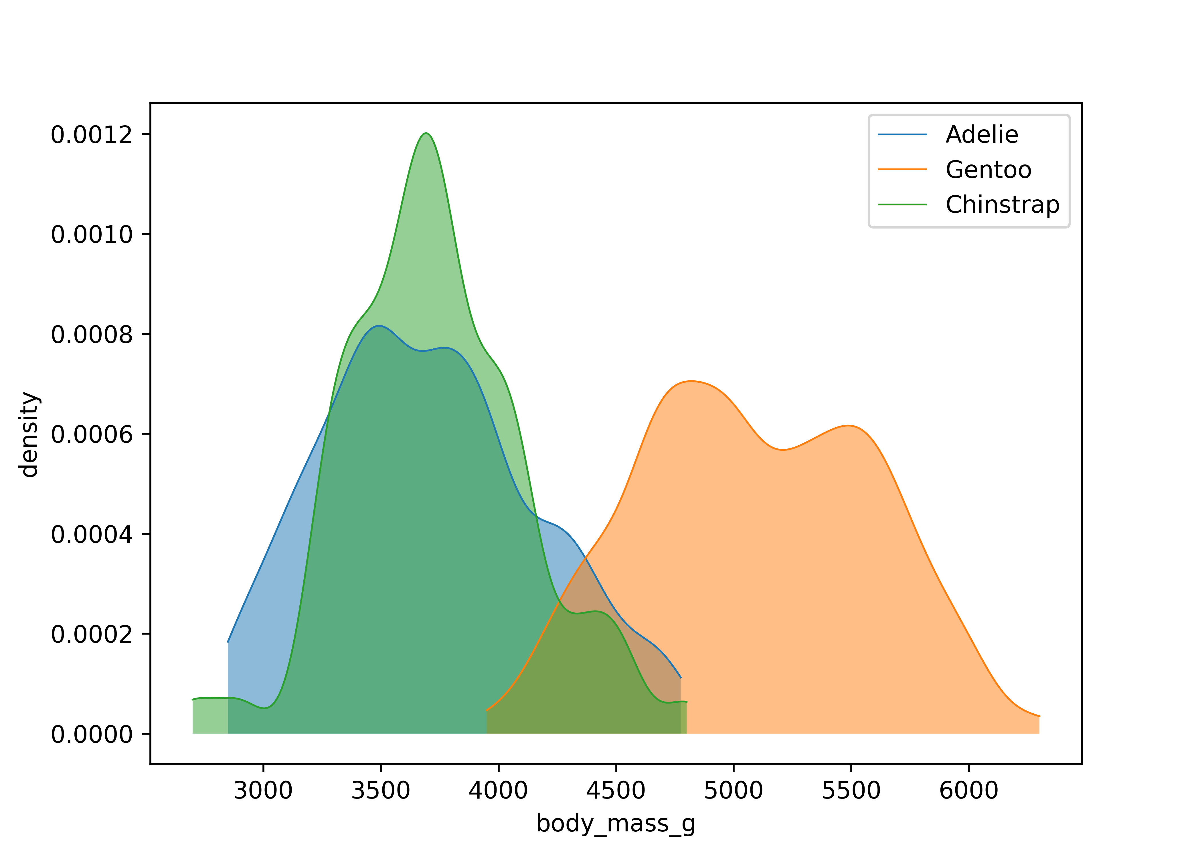
Stacked bar plots are a good way to display the relationship between two categorical columns. geom_bar() with the position argument and matplotlib.bar() are your aesthetics of choice for this task. For matplotlib, we have to first compute the shares, then sequentially fill subplots. Note that you can easily switch to counts by using position = "identity" in ggplot2 instead of relative frequencies as in the example below.
ggplot(penguins, aes(x = species, fill = island)) +
  geom_bar(position = "fill")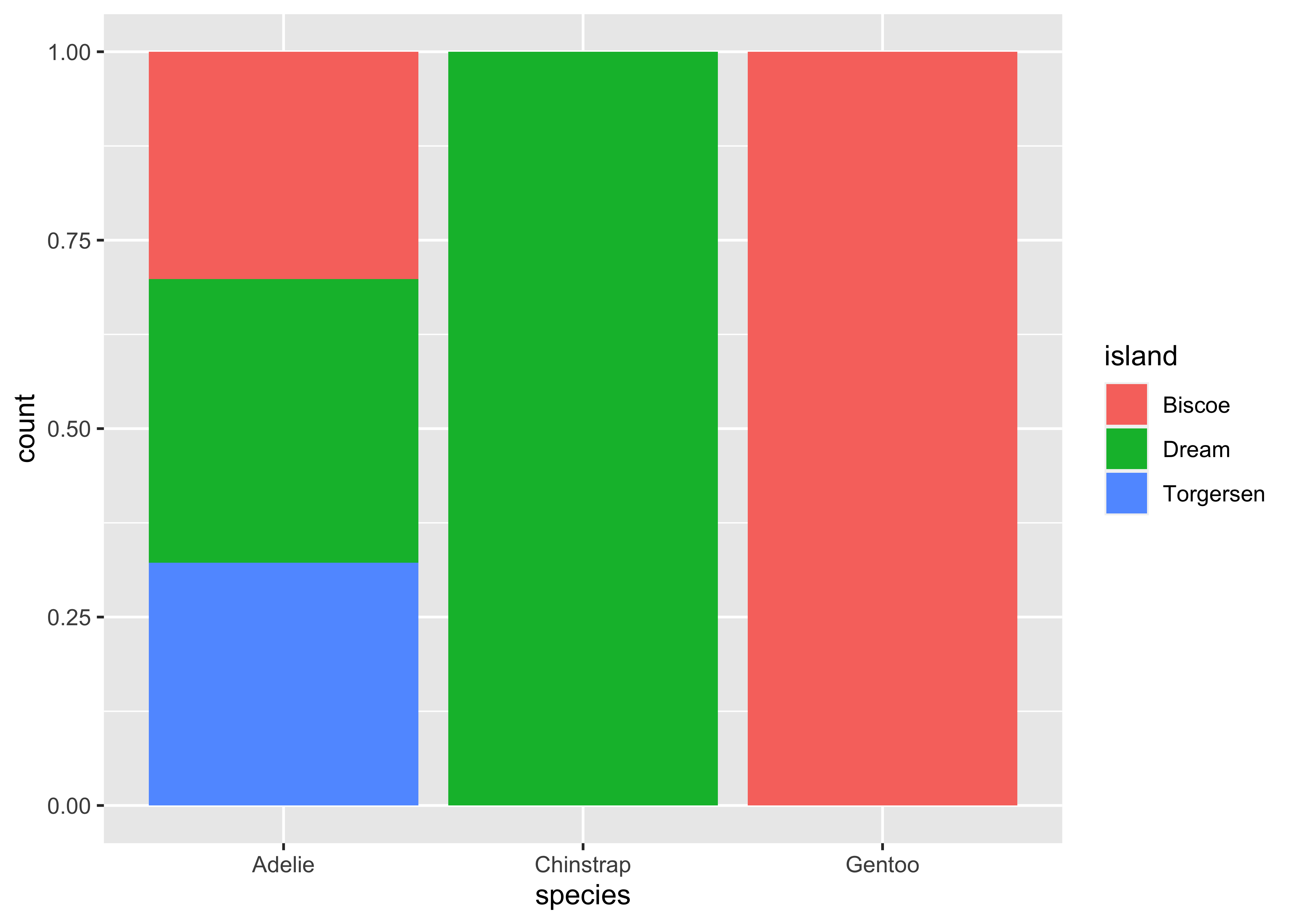
shares = (penguins
  .pipe(lambda x: pd.crosstab(x["species"], x["island"]))
  .pipe(lambda x: x.div(x.sum(axis = 1), axis = 0))
)

fig, ax = plt.subplots()
bottom = None
for island in shares.columns:
  ax.bar(shares.index, shares[island], bottom = bottom, label = island)
  bottom = shares[island] if bottom is None else bottom + shares[island]

plt.show()
Scatter plots and regression lines are definitely the most common approach for visualizing the relationship between two numerical columns and we focus on scatter plots for this example (see the first visualization example if you want to see again how to add a regression line). Here, the size parameter controls the size of the shapes that you use for the data points in ggplot2::geom_point() relative to the base size (i.e., it is not tied to any unit of measurement like pixels). For matplotlib.scatter() you have the s parameter to control point sizes manually, where size is typically given in squared points (where a point is a unit of measure in typography, equal to 1/72 of an inch).
ggplot(penguins,
       aes(x = bill_length_mm, y = flipper_length_mm)) +
  geom_point(size = 2)
plt.scatter(x = penguins["bill_length_mm"], y = penguins["flipper_length_mm"],
            s = 50)
plt.xlabel("bill_length_mm")
plt.ylabel("flipper_length_mm")

plt.show()
You can include more information by mapping columns to additional aesthetics. For instance, we can map colors and shapes to species and create separate plots for each island by using facets. Facets are actually a great way to extend your figures, so I highly recommend playing around with them using your own data.
In ggplot2 you add the facet layer at the end, whereas in matplotlib you have to start with the facet grid at the beginning and map scatter plots across facets. Note that I use variable assignment to penguins_facet in order to prevent matplotlib from printing the figure twice while rendering this post (no idea why though).
ggplot(penguins,
       aes(x = bill_length_mm, y = flipper_length_mm)) +
  geom_point(aes(color = species, shape = species)) +
  facet_wrap(~island)
species = sorted(penguins["species"].unique())
islands = sorted(penguins["island"].unique())

color_map = dict(zip(species, ["blue", "green", "red"]))
shape_map = dict(zip(species, ["o", "^", "s"]))

fig, axes = plt.subplots(ncols = len(islands))

for ax, island in zip(axes, islands):
  island_data = penguins[penguins["island"] == island]
  for spec in species:
    spec_data = island_data[island_data["species"] == spec]
    ax.scatter(spec_data["bill_length_mm"], spec_data["flipper_length_mm"],
               color = color_map[spec], marker = shape_map[spec], label = spec)
  ax.set_title(island)
  ax.set_xlabel("Bill Length (mm)")
  ax.set_ylabel("Flipper Length (mm)")

axes[0].legend(title = "Species")
plt.tight_layout()

plt.show()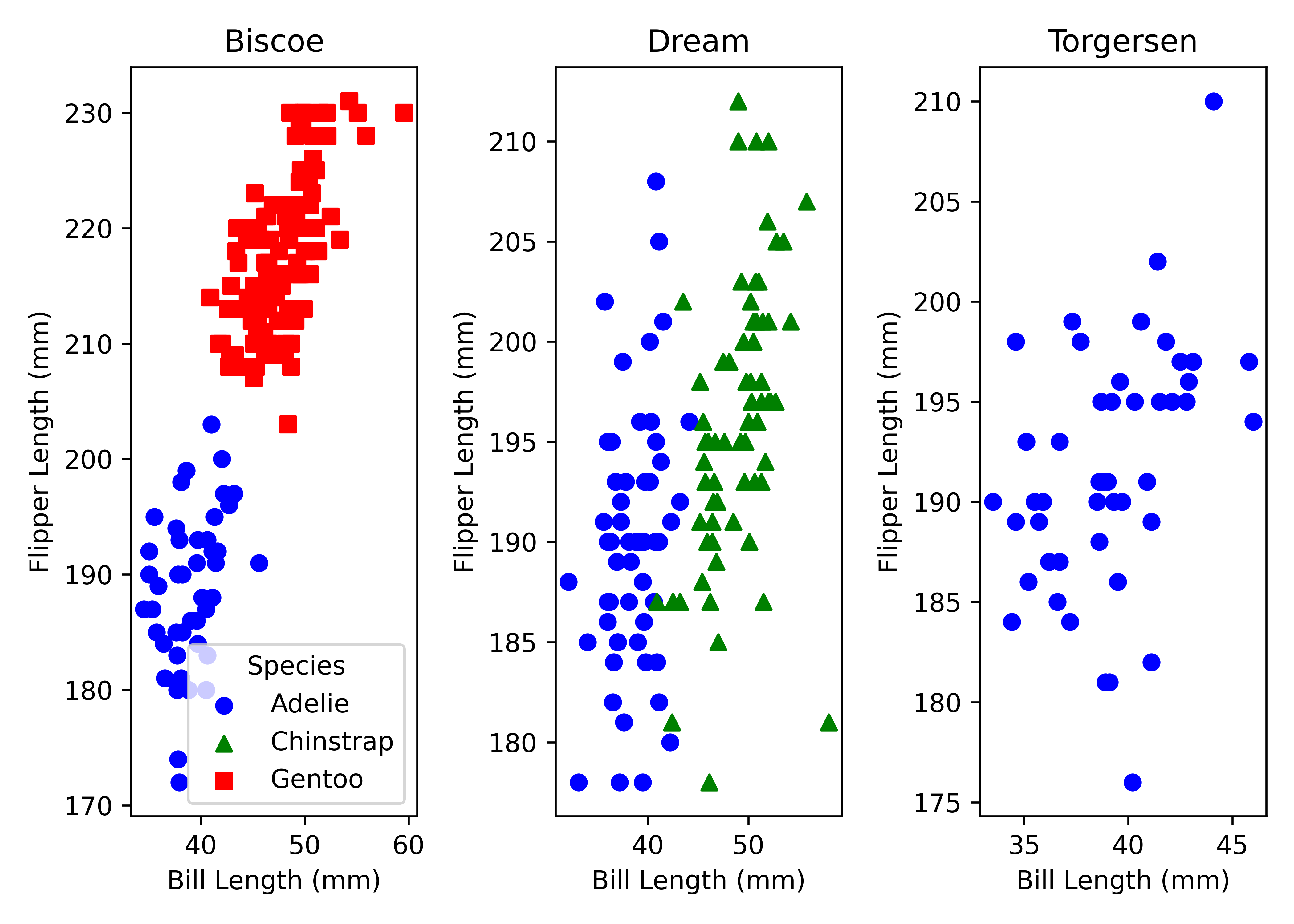
As a last example, we quickly dive into time series plots where you typically want to show multiple lines over some time period. Here, I aggregate the number of penguins by year and island and plot the corresponding lines. All packages behave as expected and show similar output.
matplotlib does not directly support setting line styles based on a variable like island within its syntax. Instead, you have to iterate over each island and manually set the line style for each island.
penguins |>
  count(year, island) |>
  ggplot(aes(x = year, y = n, color = island)) +
  geom_line(aes(linetype = island))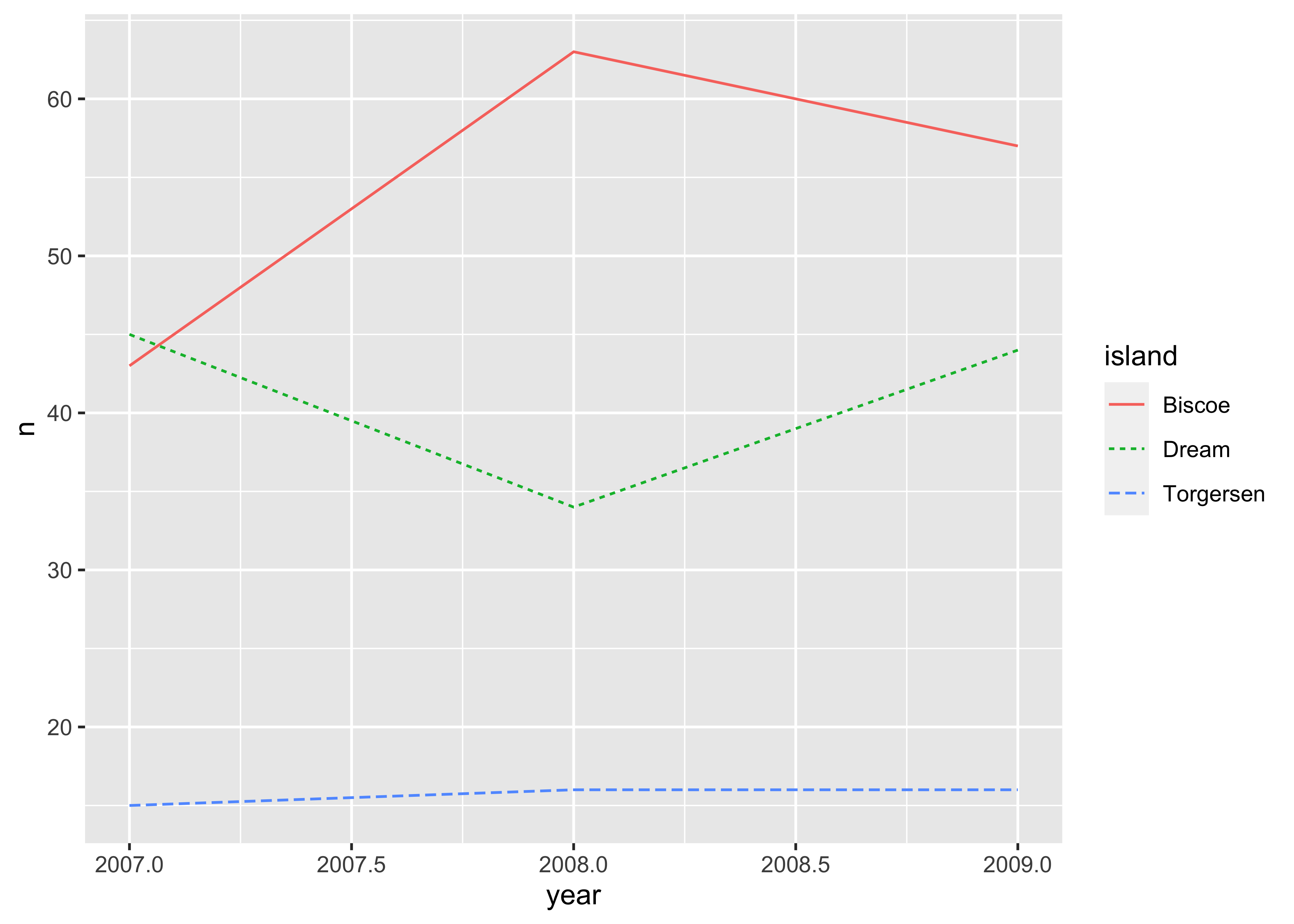
count_data = (penguins
  .groupby(["year", "island"])
  .size()
  .reset_index(name="count")
)

islands = count_data["island"].unique()
colors = ["red", "green", "blue"]
line_styles = ["-", "--", "-."]

plt.figure()
for j, island in enumerate(islands):
  island_data = count_data[count_data["island"] == island]
  plt.plot(island_data["year"], island_data["count"],
           color = colors[j],
           linestyle = line_styles[j],
           label = island)

plt.xlabel("year")
plt.ylabel("count")
plt.legend(title = "island")

plt.show()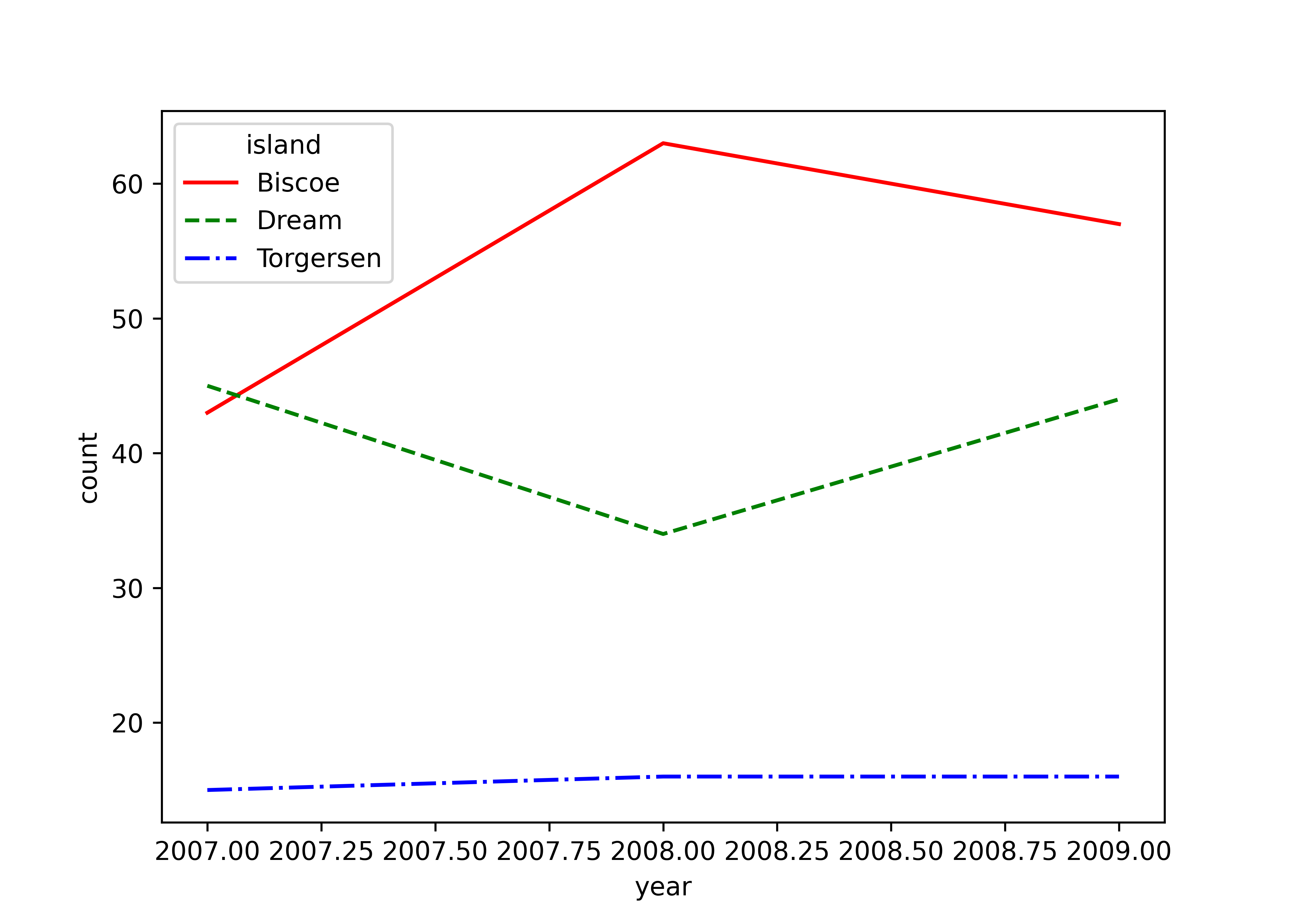
As a final comparison, let us look at saving plots. ggplot2::ggsave() provides the most important options as function paramters. In matplotlib, you have to tweak the figure size before you can save the figure.
penguins_figure <- penguins |>
  ggplot(aes(x = bill_length_mm, y = flipper_length_mm)) +
  geom_point()

ggsave(penguins_figure, filename = "penguins-figure.png",
       width = 7, height = 5, dpi = 300)
plt.figure(figsize = (7, 5))
plt.scatter(x = penguins["bill_length_mm"], y = penguins["flipper_length_mm"])
plt.xlabel("bill_length_mm")
plt.ylabel("flipper_length_mm")
plt.savefig("penguins-figure.png", dpi = 300)In terms of syntax, ggplot2 and matplotlib are considerably different. ggplot2 uses a declarative style where you declare what the plot should contain. You specify mappings between data and aesthetics (like color, size) and add layers to build up the plot. This makes it quite structured and consistent. matplotlib, on the other hand, follows an imperative style where you build plots step by step. Each element of the plot (like lines, labels, legend) is added and customized using separate commands. It allows for a high degree of customization but can be verbose for complex plots.
I think both approaches are powerful and have their unique advantages, and the choice between them often depends on your programming language preference and specific requirements of the data visualization task at hand.